Final 3 Logos


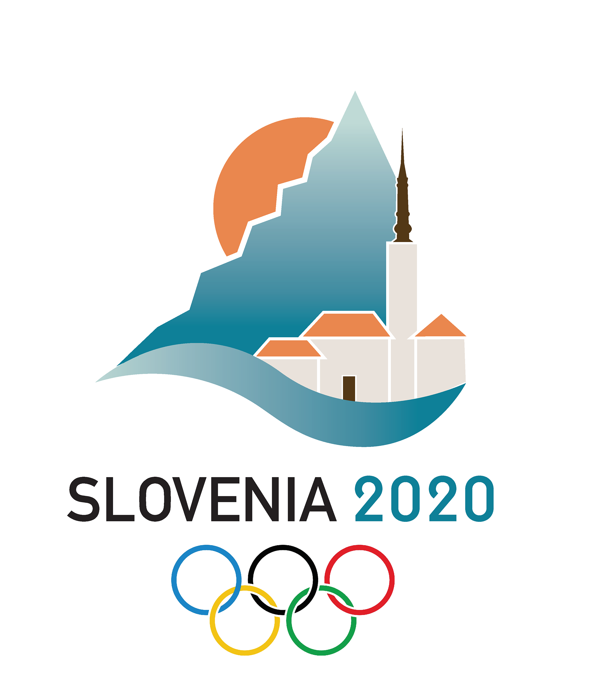
Olympic Logo: Slovenia 2020
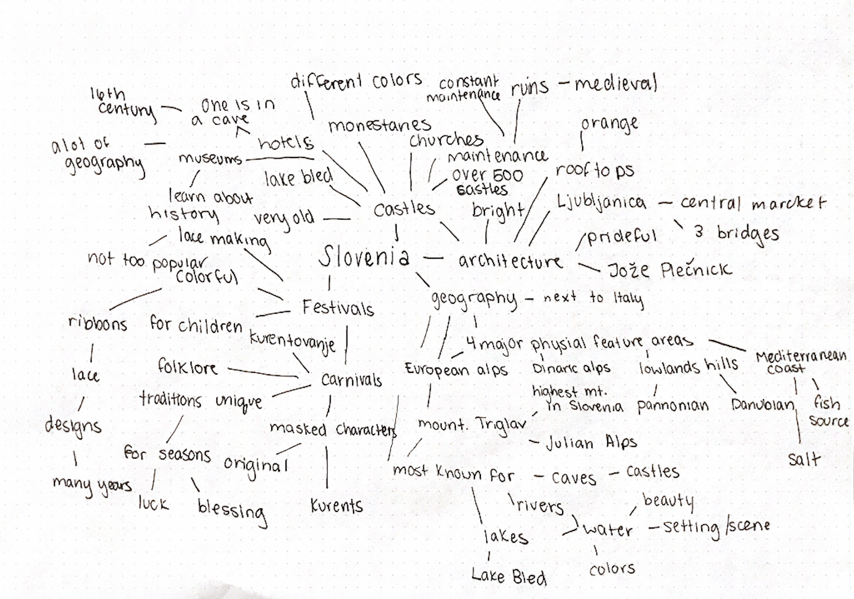
The goal of my logo is to depict what Slovenia is known and loved for the most. This will be shown through mountains that represent the alps, and the popular Lake Bled church that is isolated on the lake itself. There will be an integration of both of these elements which can be depicted in many pictures taken there. Slovenia is most known for its lakes, alps, castles, and churches so I decided to choose them in order to represent that. The colors that were chosen for the logo due to them being seen the most within the country. The oranges are seen on the rooftops of areas such as Ljubljanica, and the blues and greys can be seen in lakes and on the alps.
Research: Mind Map
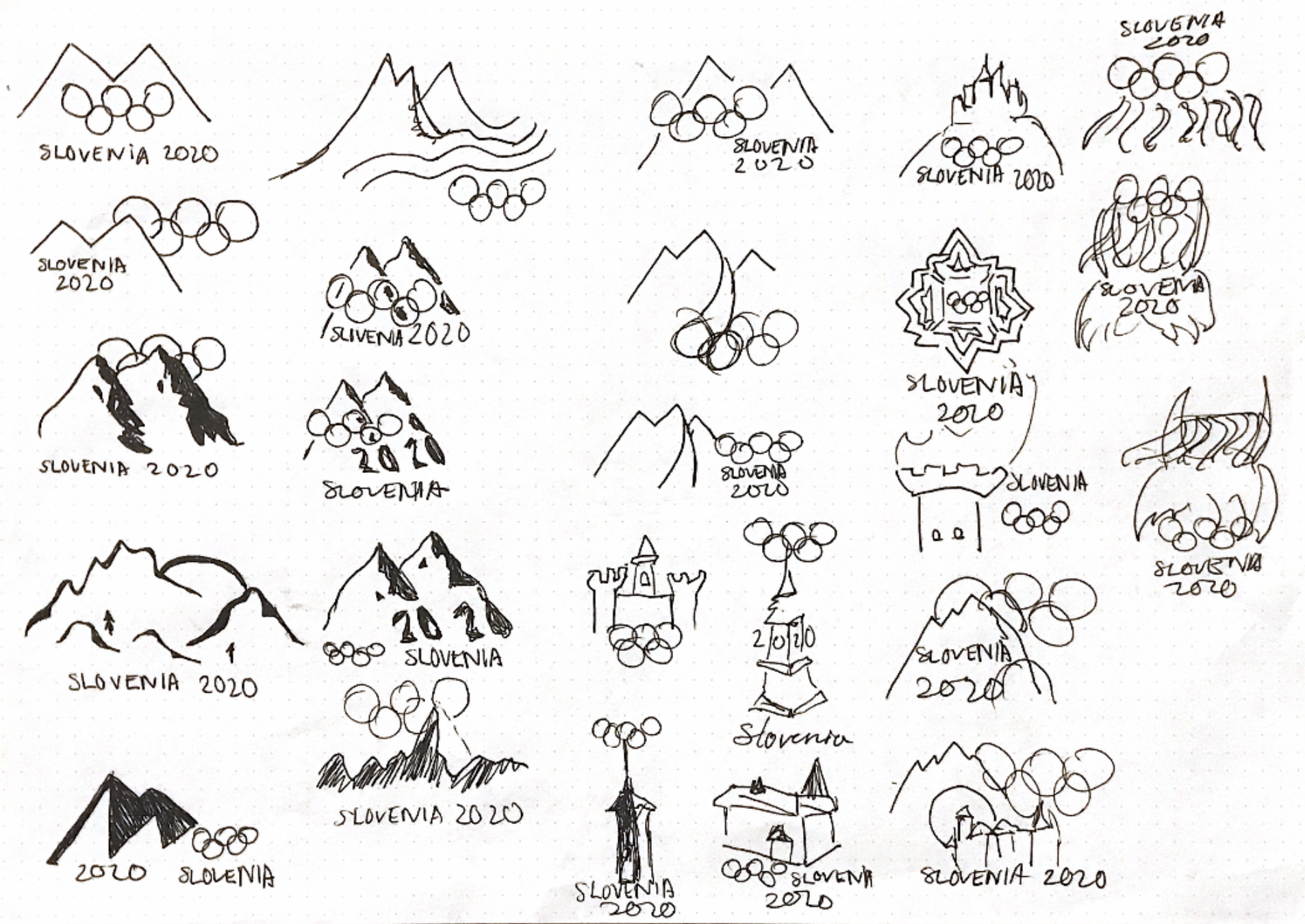
Sketches
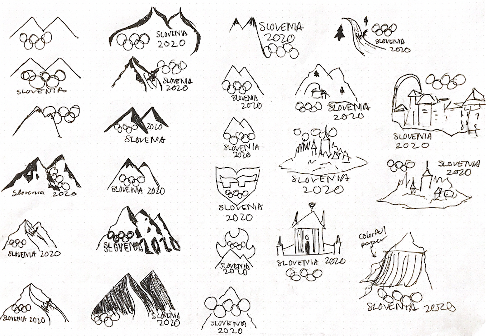
Digital Sketches/Iterations

Typography Studies


Final Logo
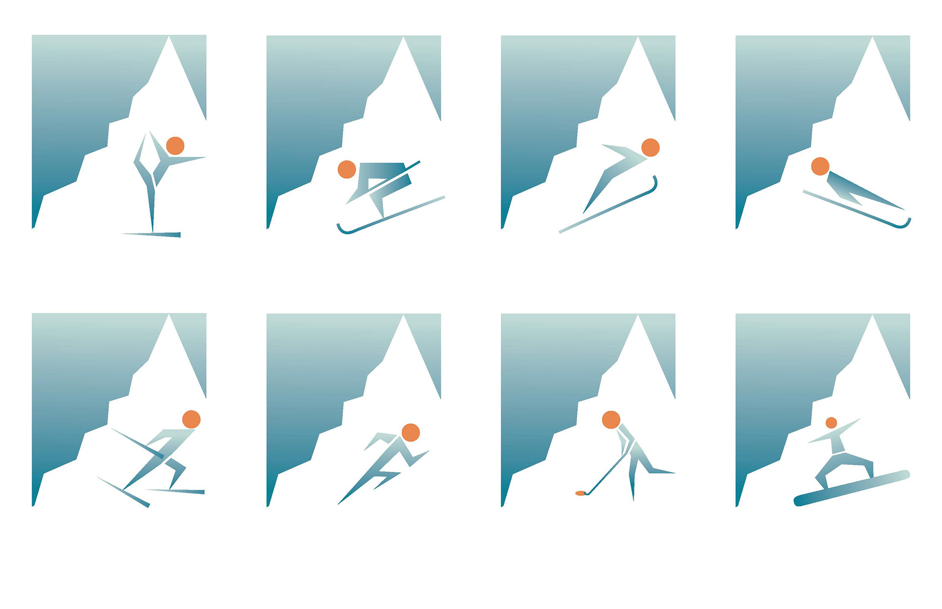
Pictographs
Como Zoo Logo
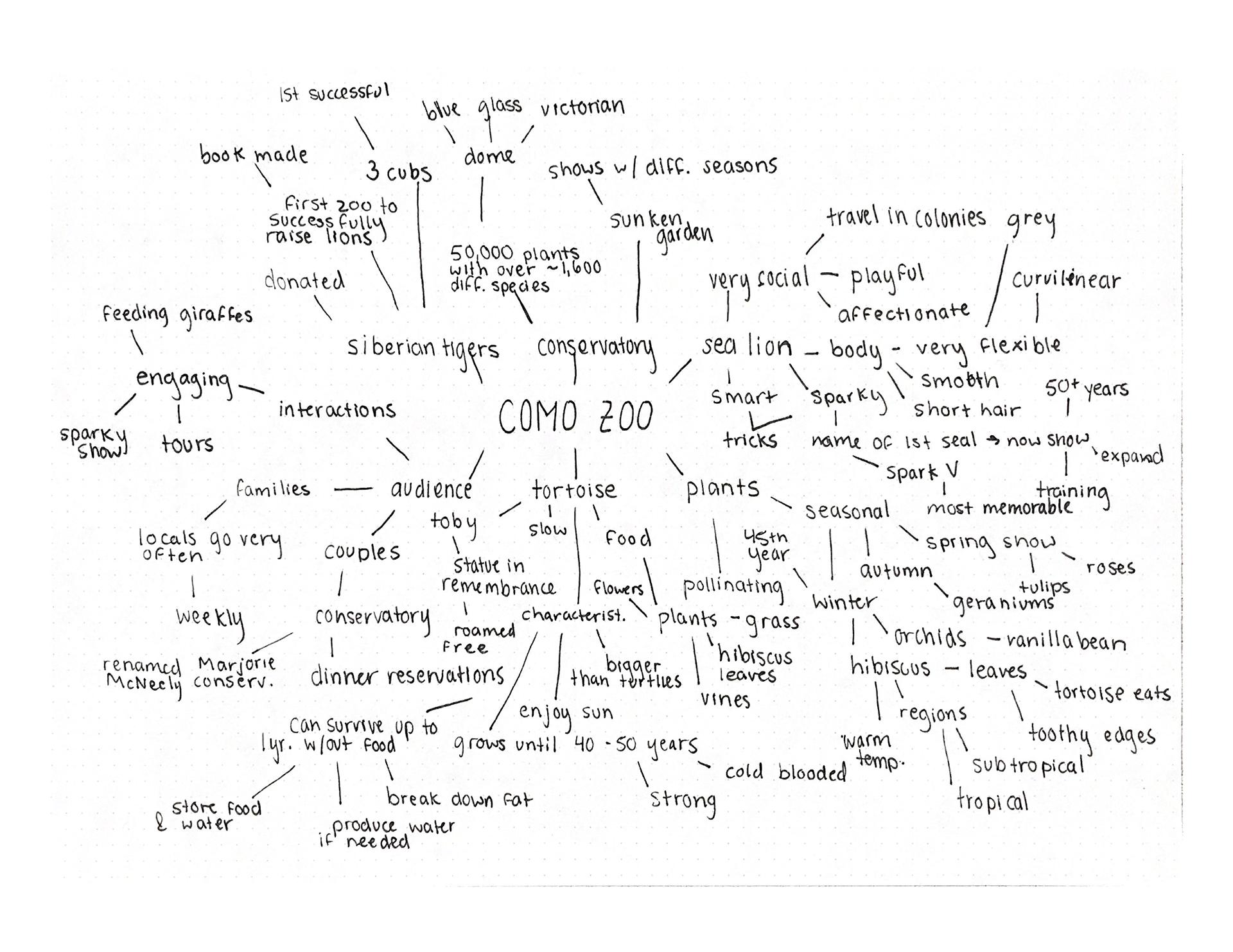
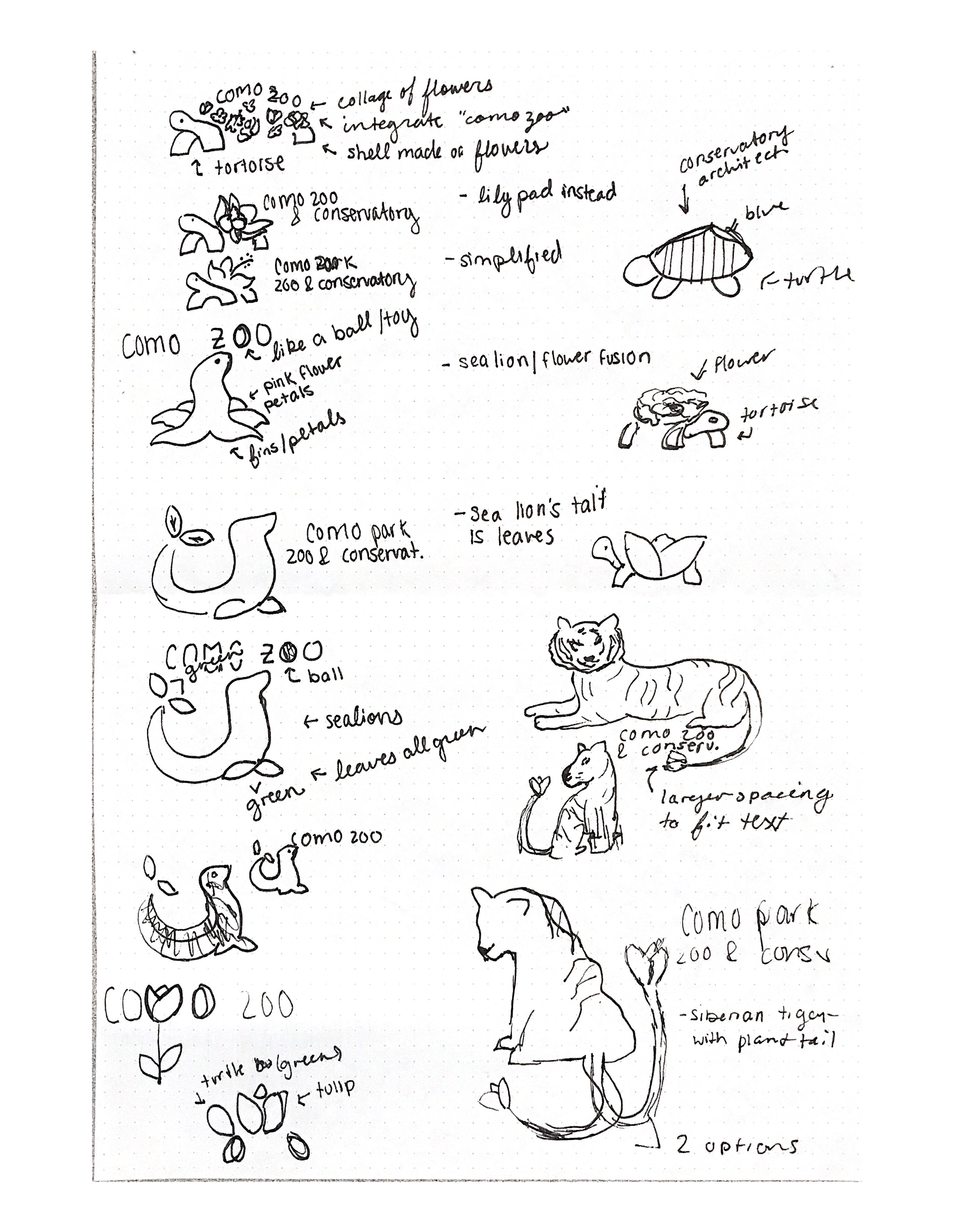
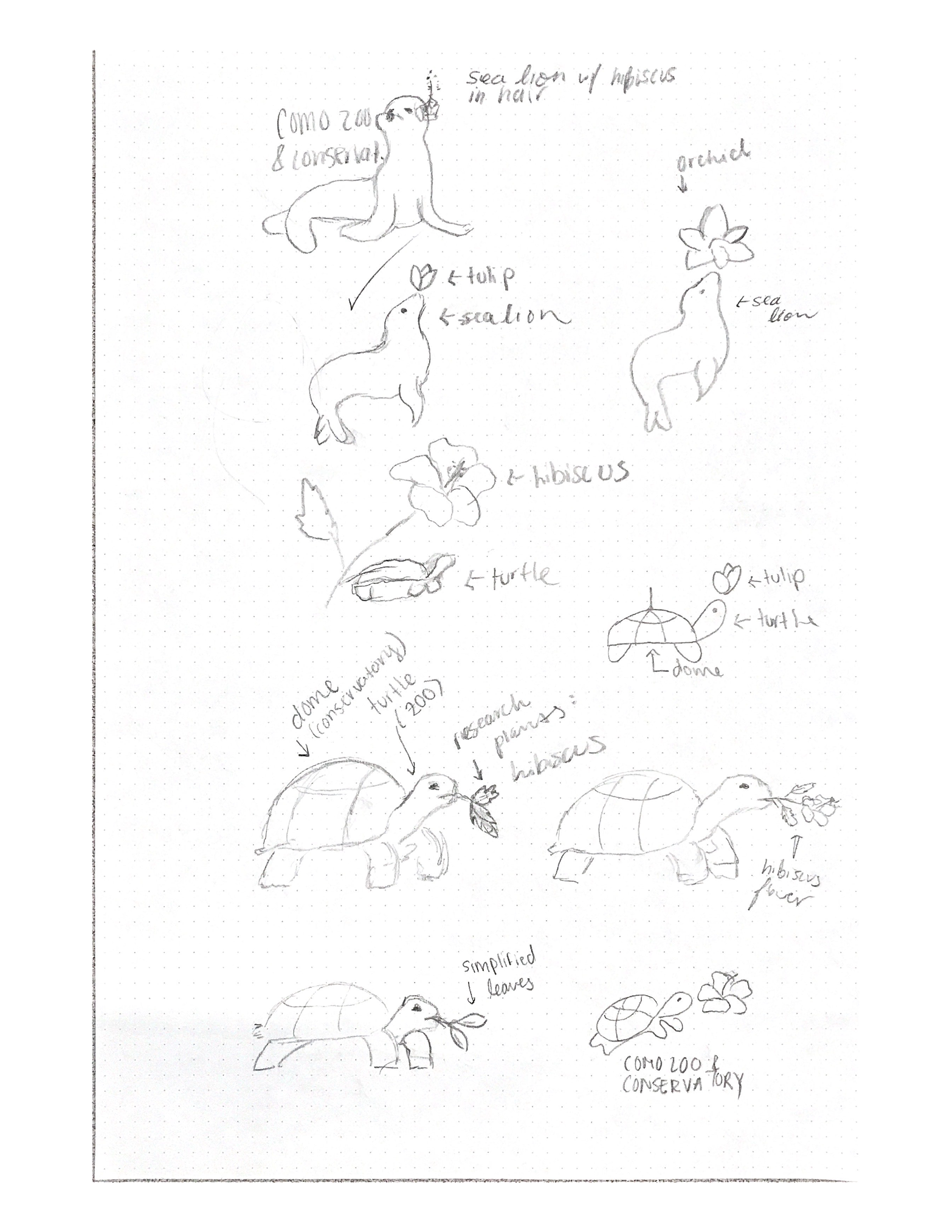
The goal of my logo is to depict why Como Zoo & Conservatory is significant and beloved by the community. This will be shown through symbols of the animals that have impacted the place the most. I integrated a Galapagos tortoise with the architecture of the conservatory in order to emphasize what makes this zoo distinct from any others. This location goes out of their way to preserve hundreds of plant species and take care of their animals. They have had multiple animals that leave an impact on the employees and visitors of the park. This includes animals such as Toby the Tortoise and the sea lions at the Sparky shows that take place. This zoo is aimed at people of all ages. Families are the ones that tend to visit the most. I want my logo to show the intimate and memorable parts of Como Zoo because its current logo doesn’t seem to deliver that.
Research: Mind Map
Sketches
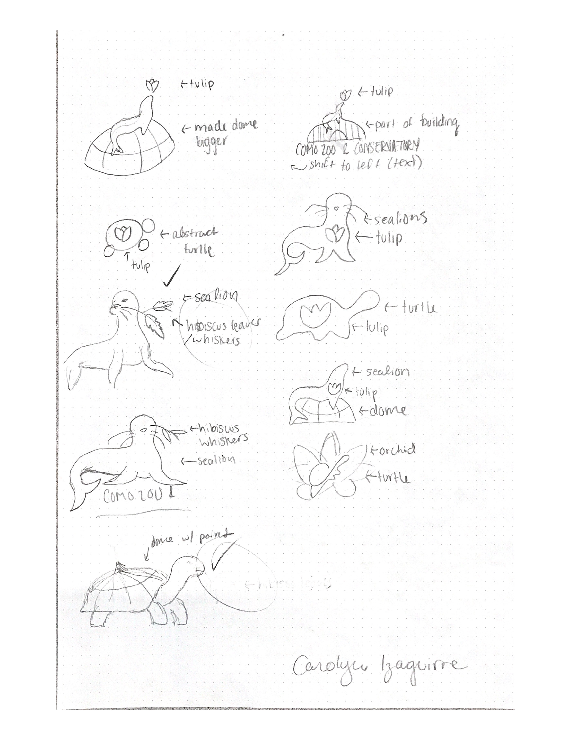
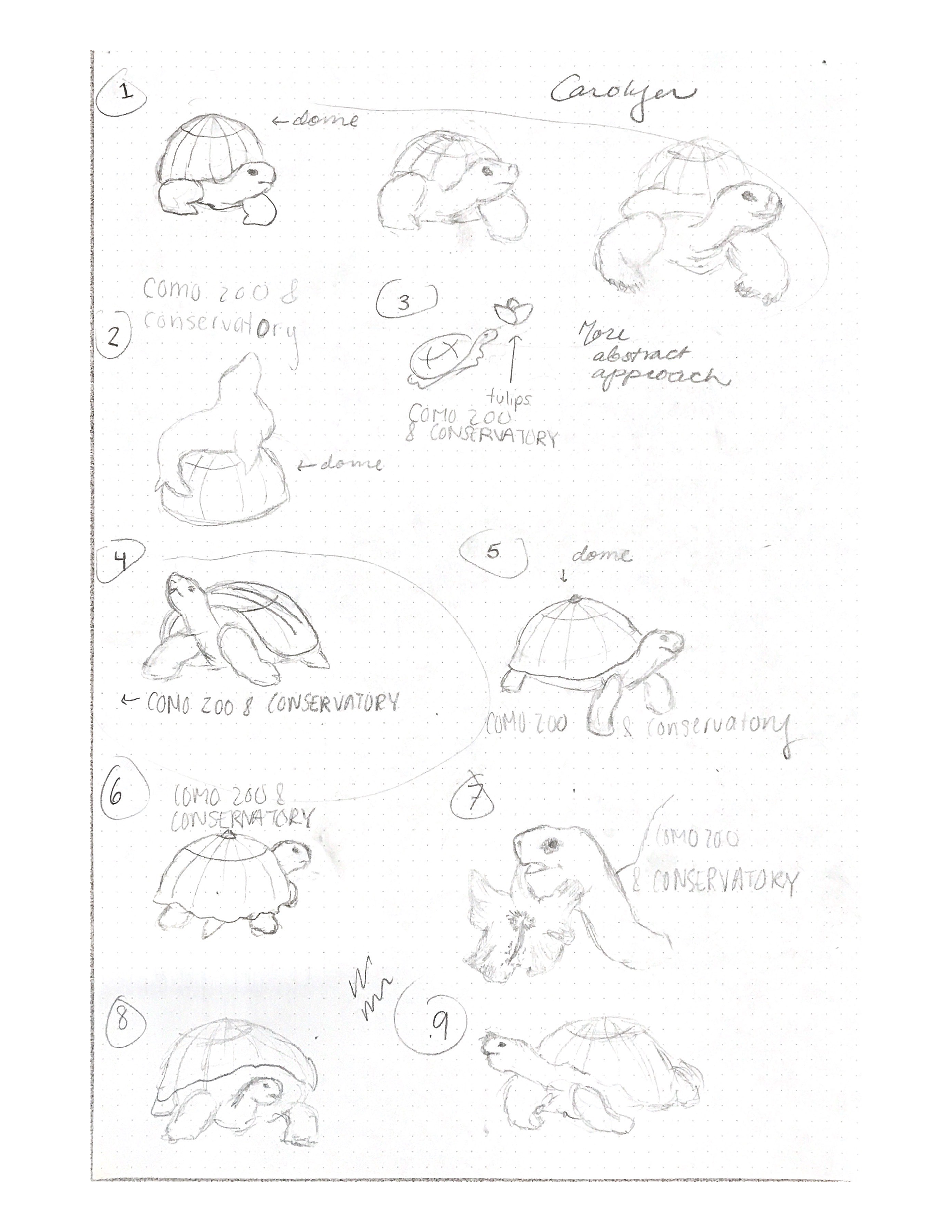
Digital Sketches/Iterations
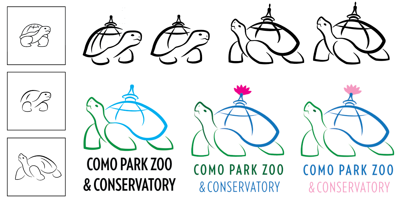
Final Logo

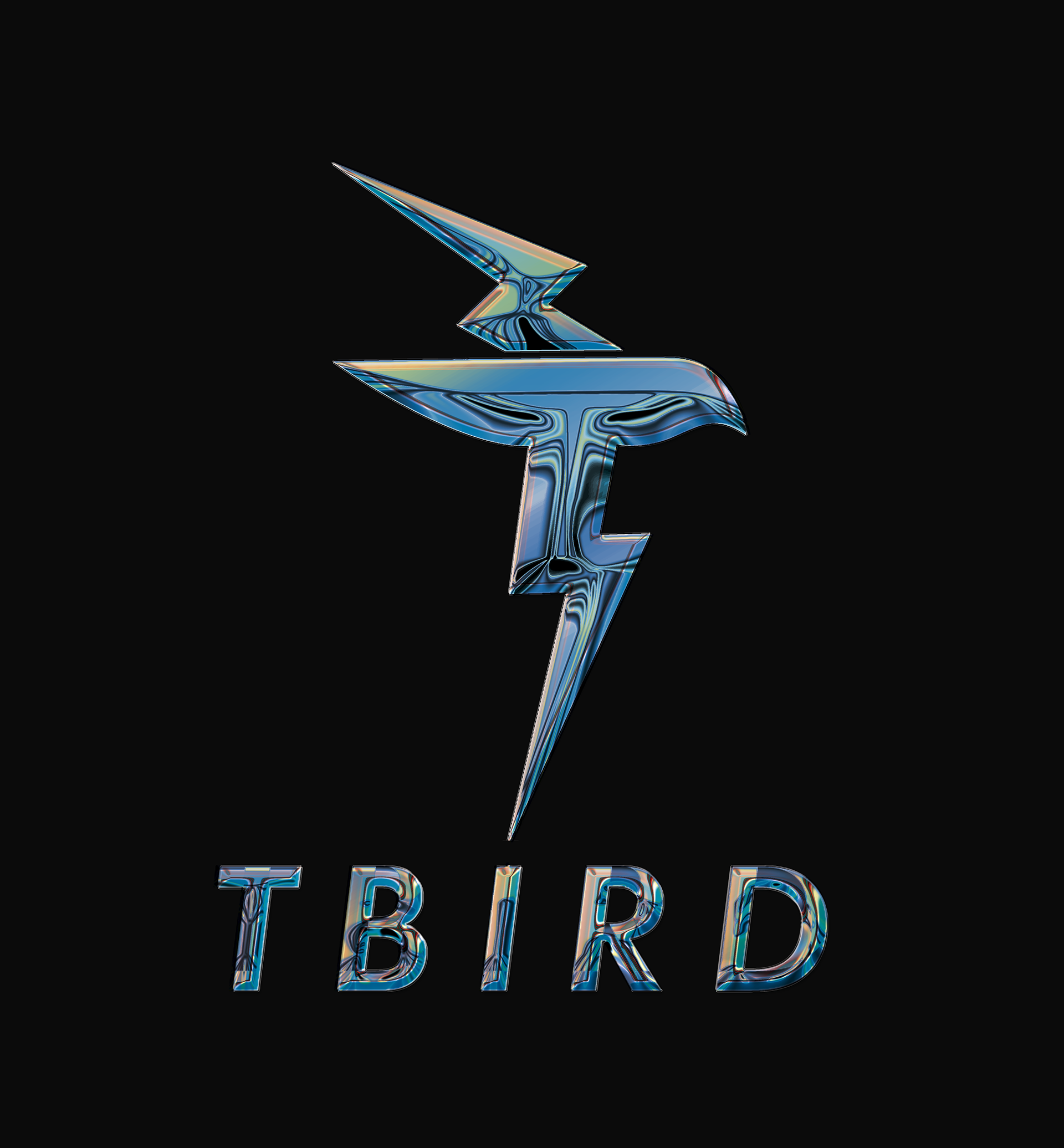
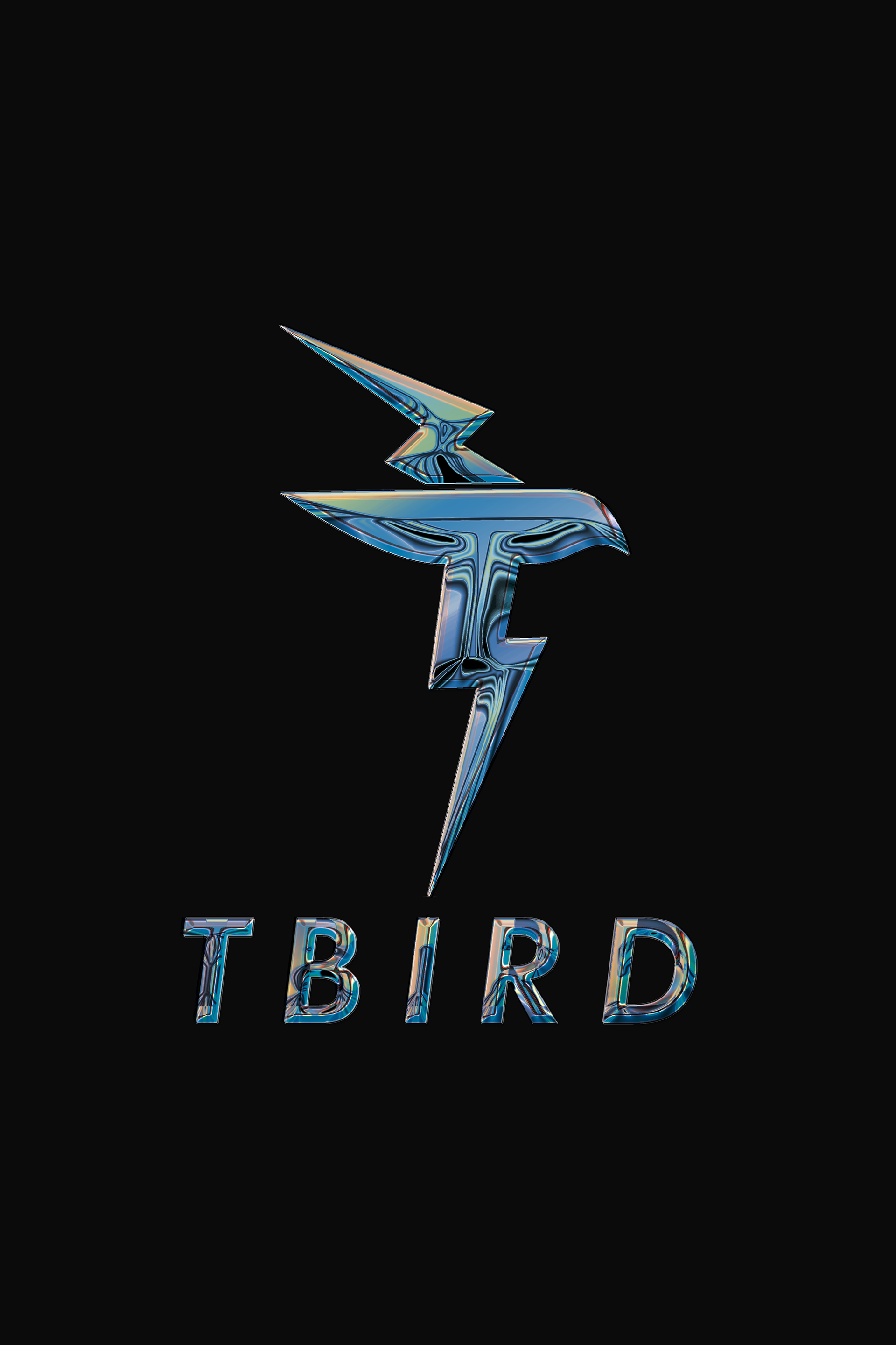
Car Logo: Ford Thunderbird
I decided to integrate a bird, thunder, and the letter T in order to achieve my goal of representing what this car is all about. The T emphasizes the nickname that was given to the Thunderbird, and since we were trying to make a logo for a car no longer in reproduction I thought it best to make it modern. Shortening the name to its nickname and using a sans serif was the way I decided to establish that. I decided to go with an italicized version of Futura because it implies movement. I also decided to integrate the thunder within the logo in order to symbolize the speed and strength the Thunderbird has. I integrated the thunder into the wings - having the bottom one connect with the birds body in order to deliver the subtle letter “T” within the logo.
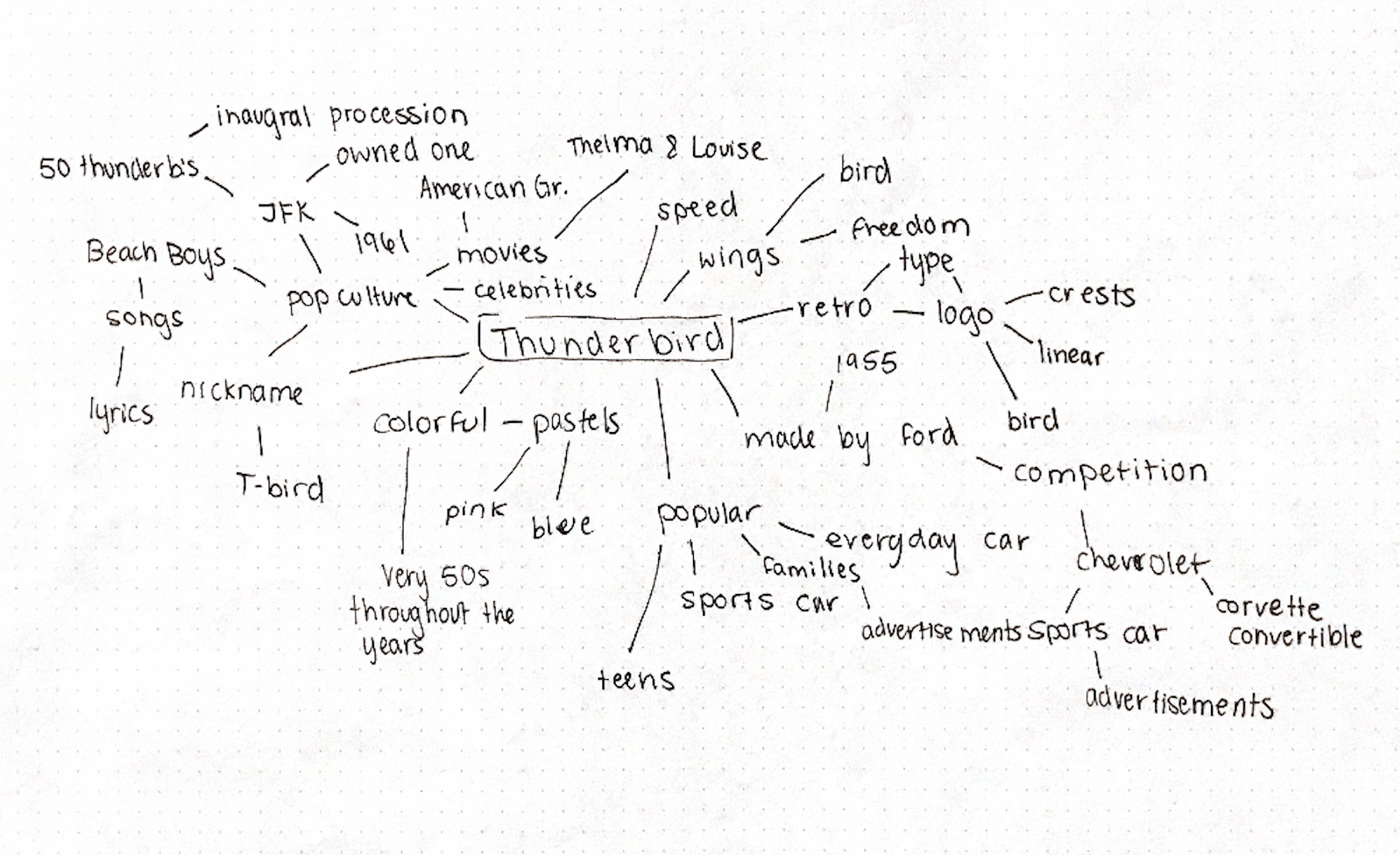
Research: Mind Map
Sketches


Digital Sketches/Iterations
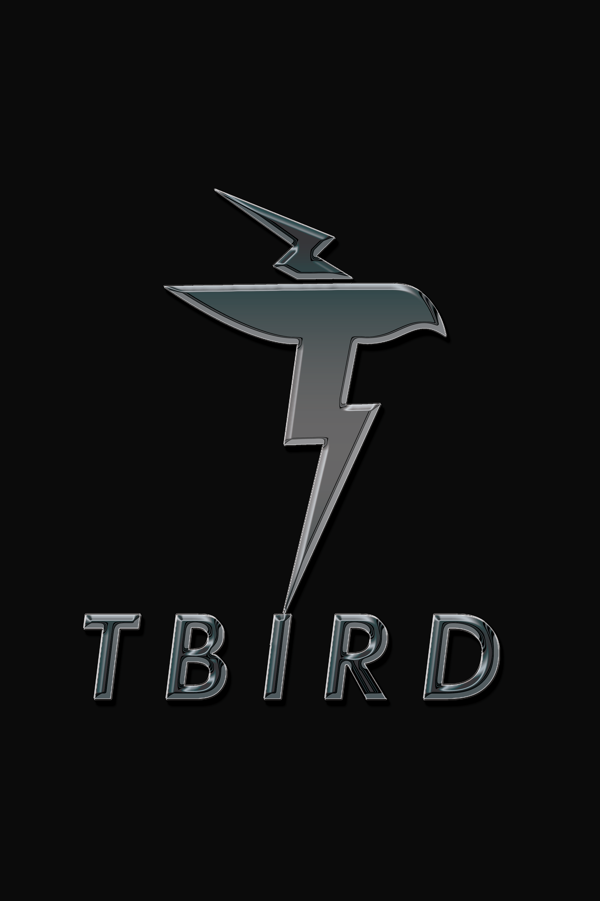


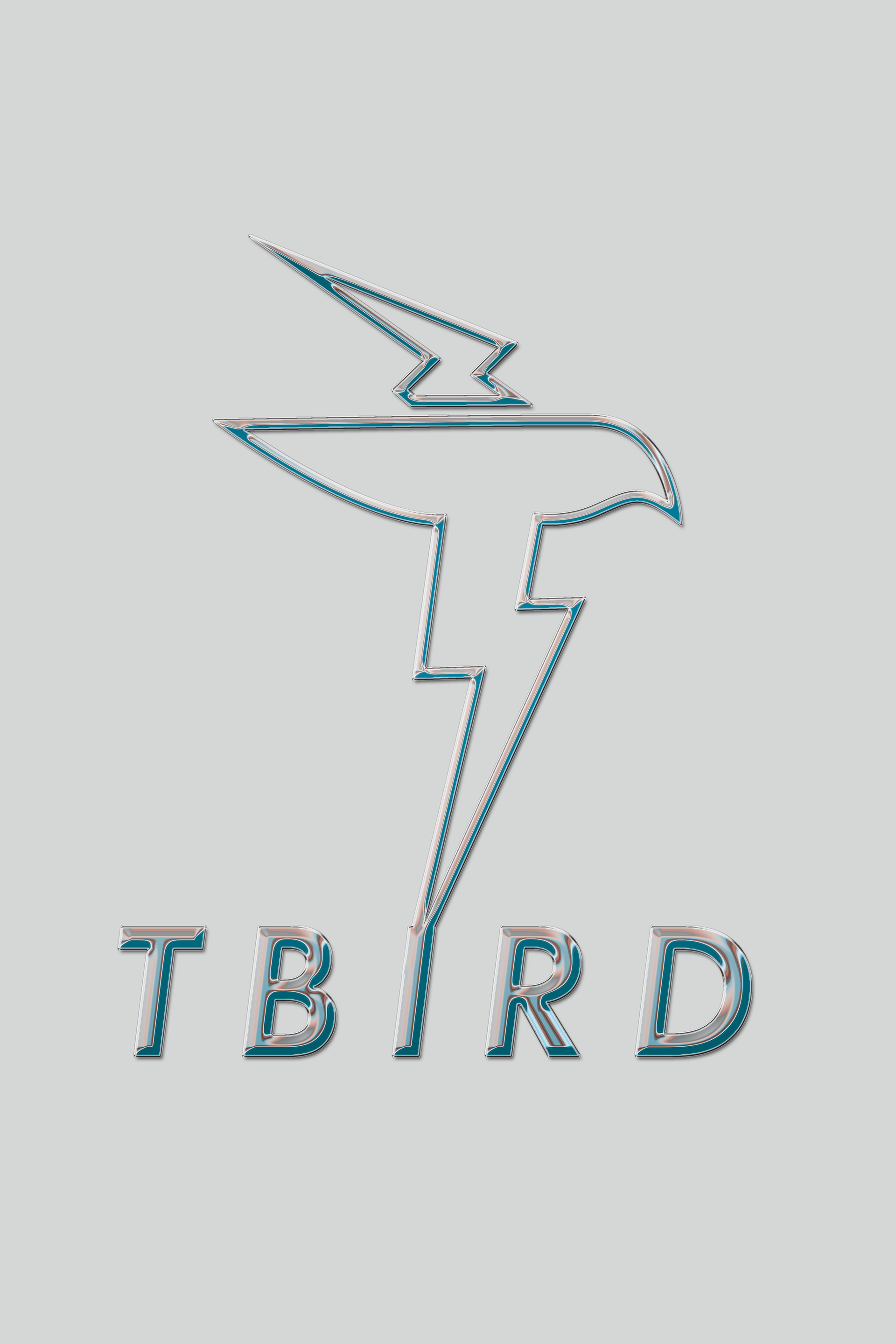
Final Logo