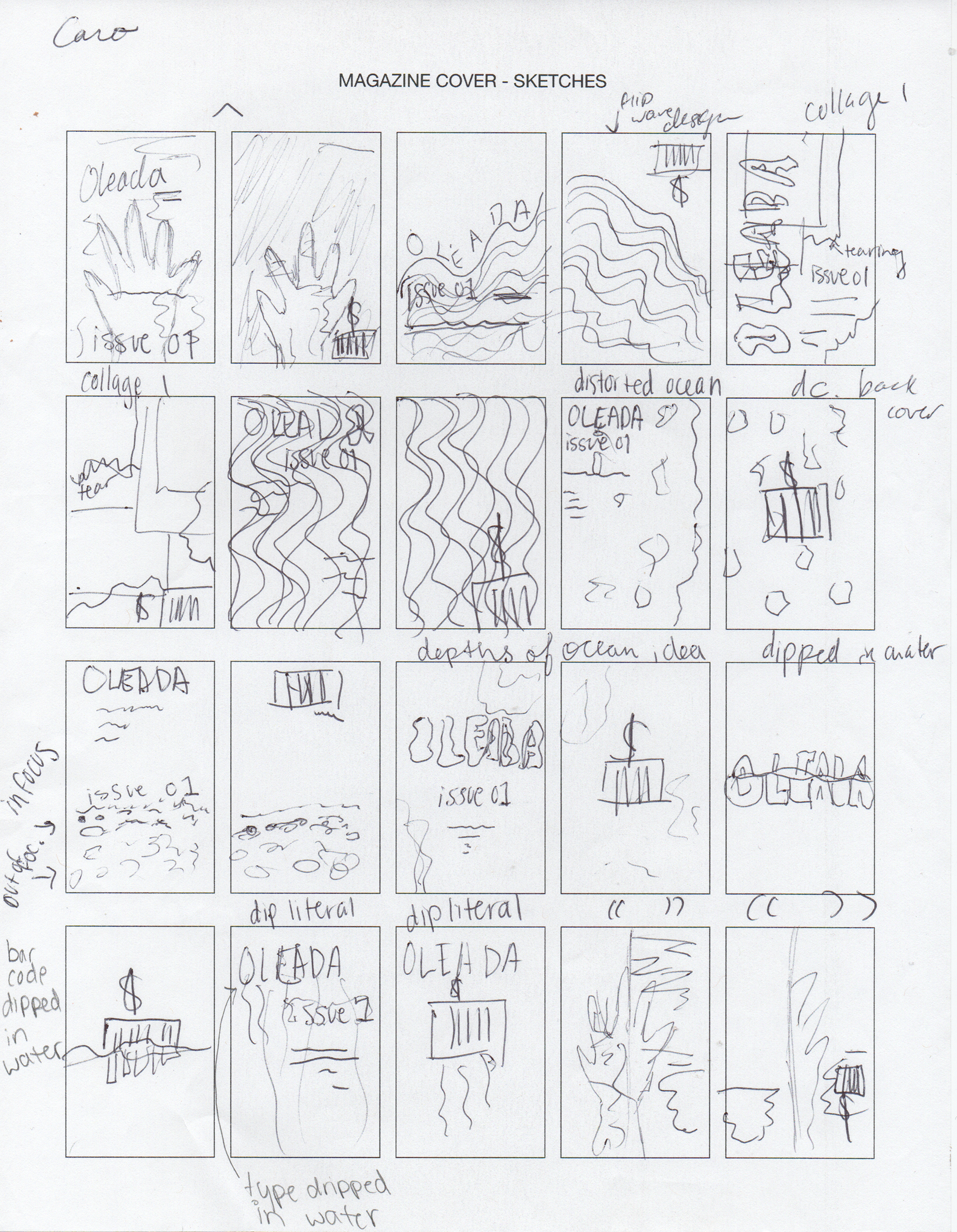
Sketches
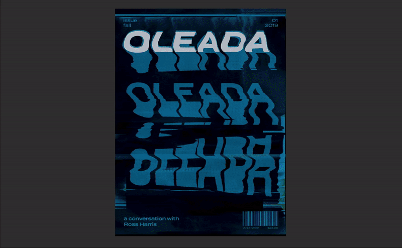
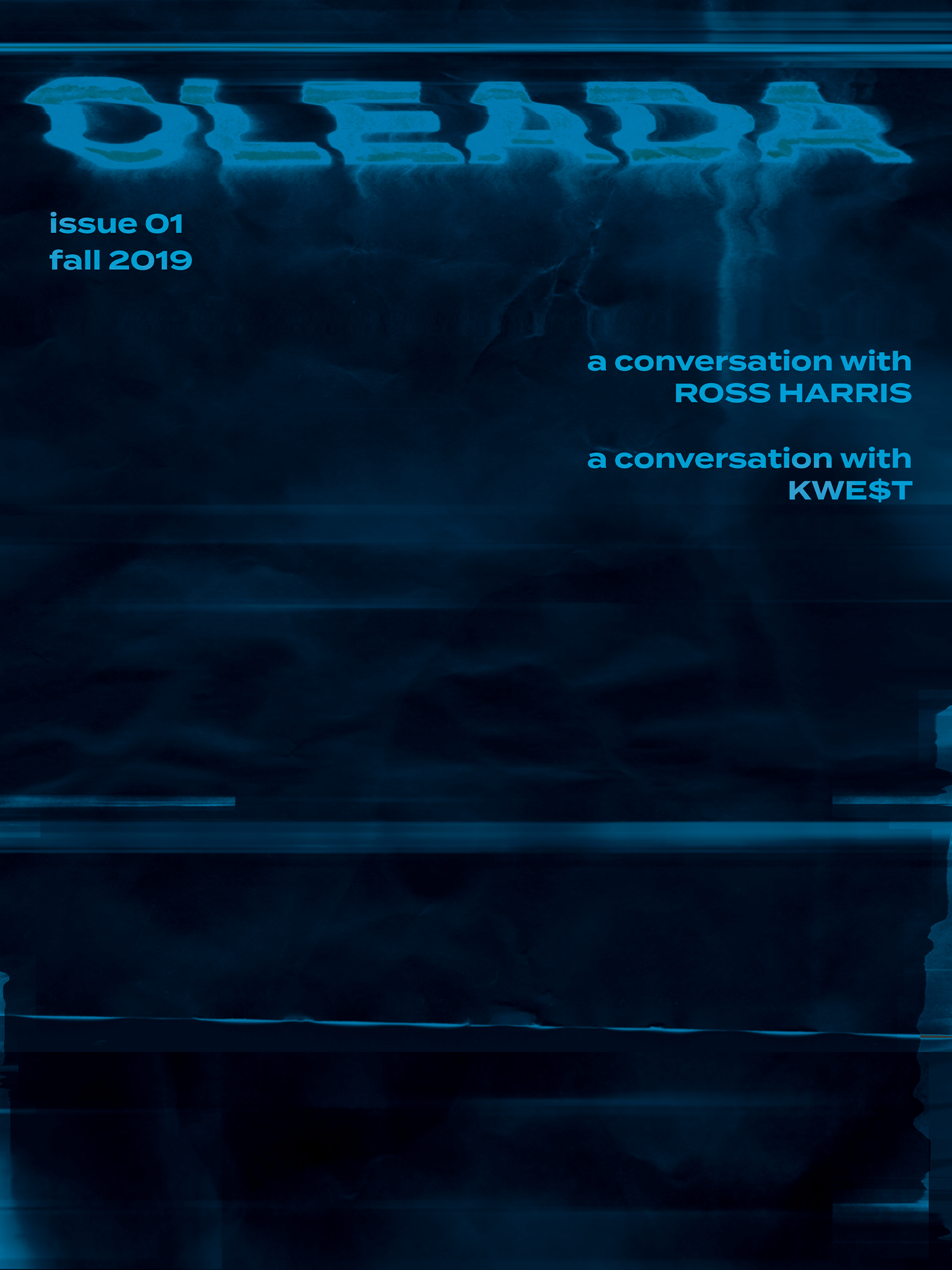
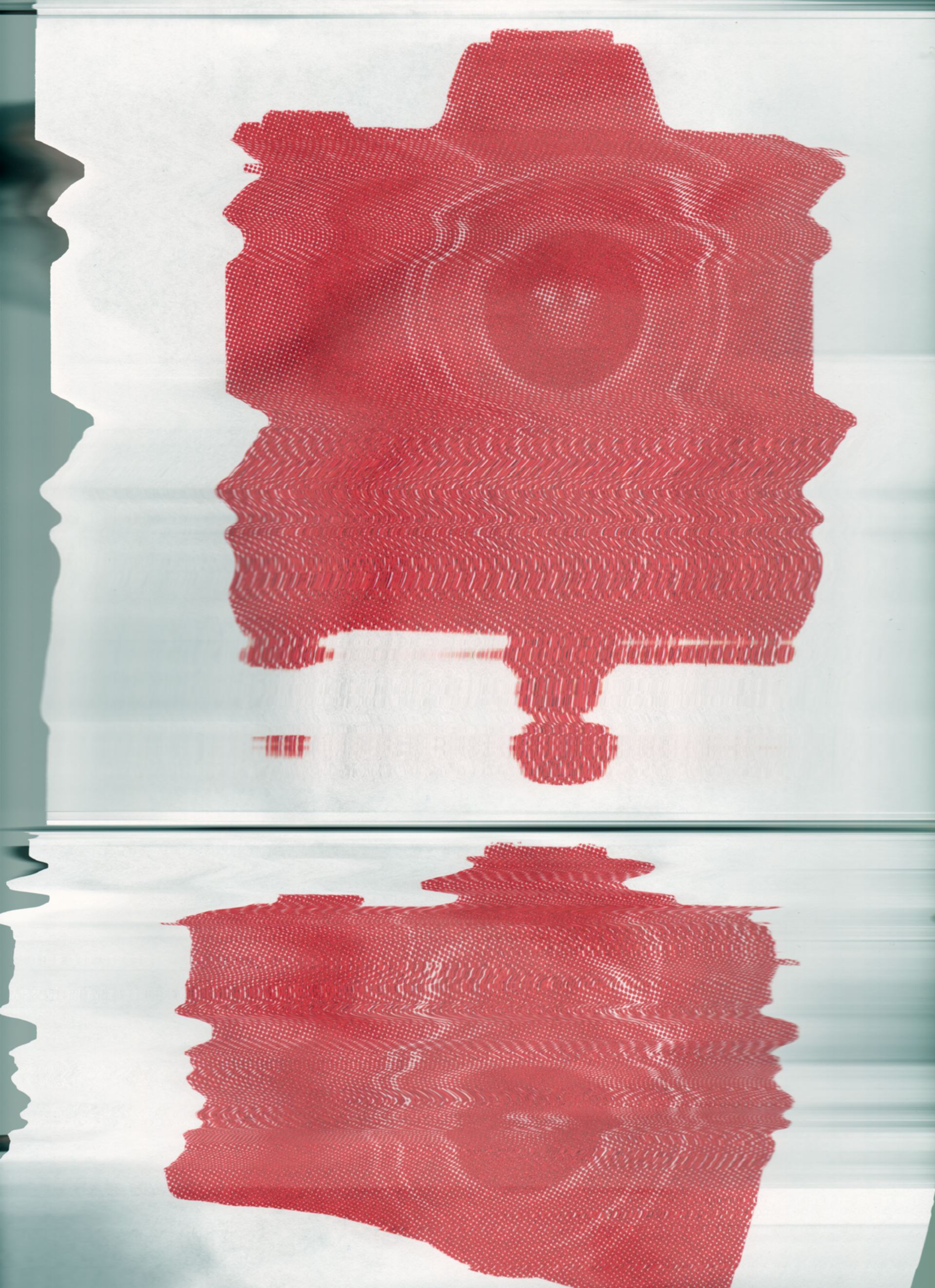
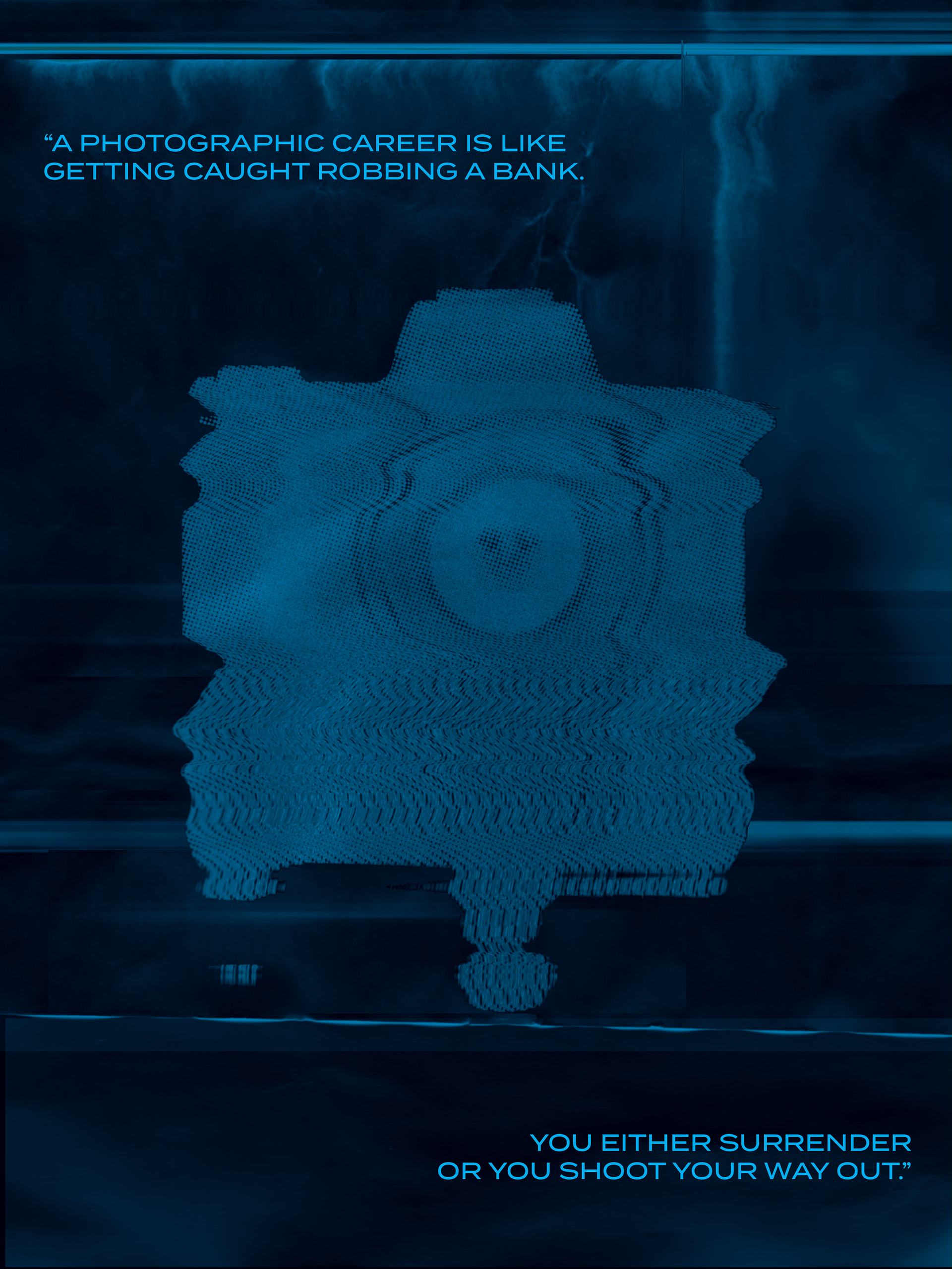
I wanted the cover to represent the title of the magazine. I wanted to visually show a sense of depth and overwhelmingness through the idea of water. My magazine focuses itself on these individual's life changes and how it has affected them since then; because of this, I needed the cover to emphasize that feeling of thought through the color blue as well.
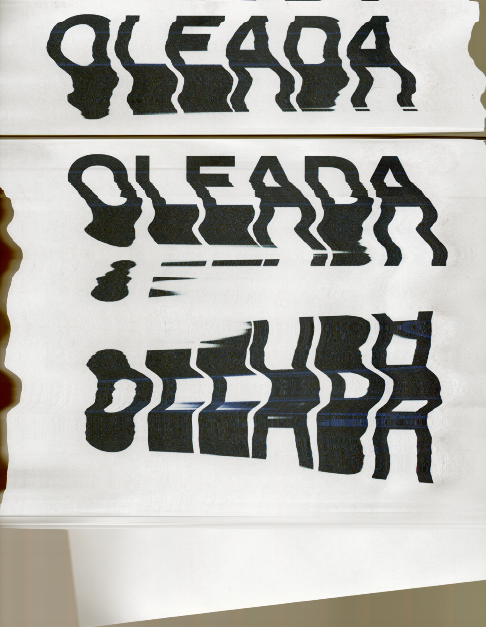
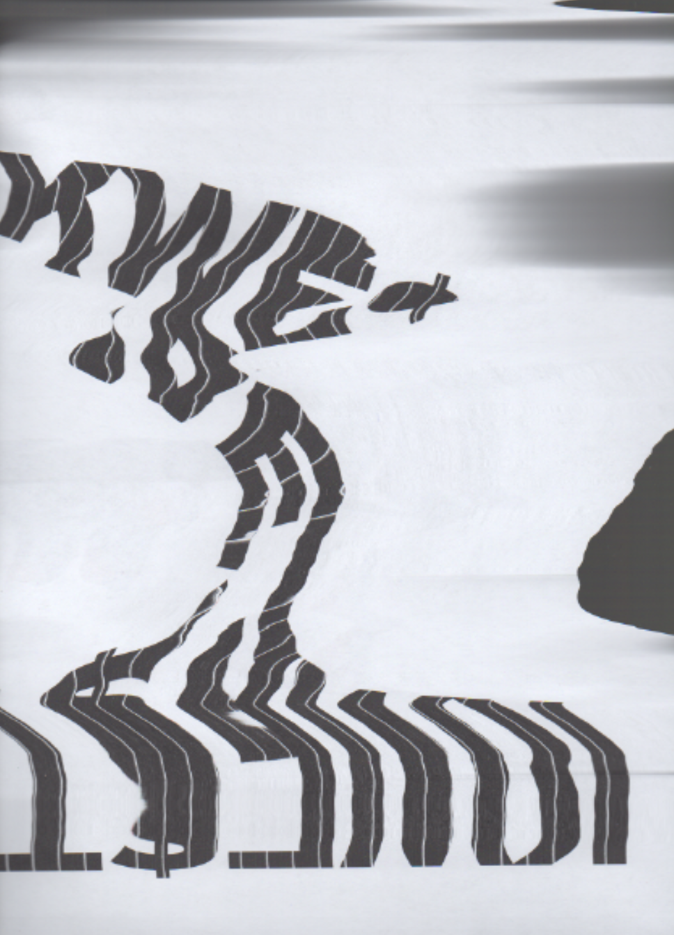
Within my sketches it can be seen that I had an idea to make my text or the barcode look as if the ink has run. This would give it that sense of it being underwater.
Cover Iterations
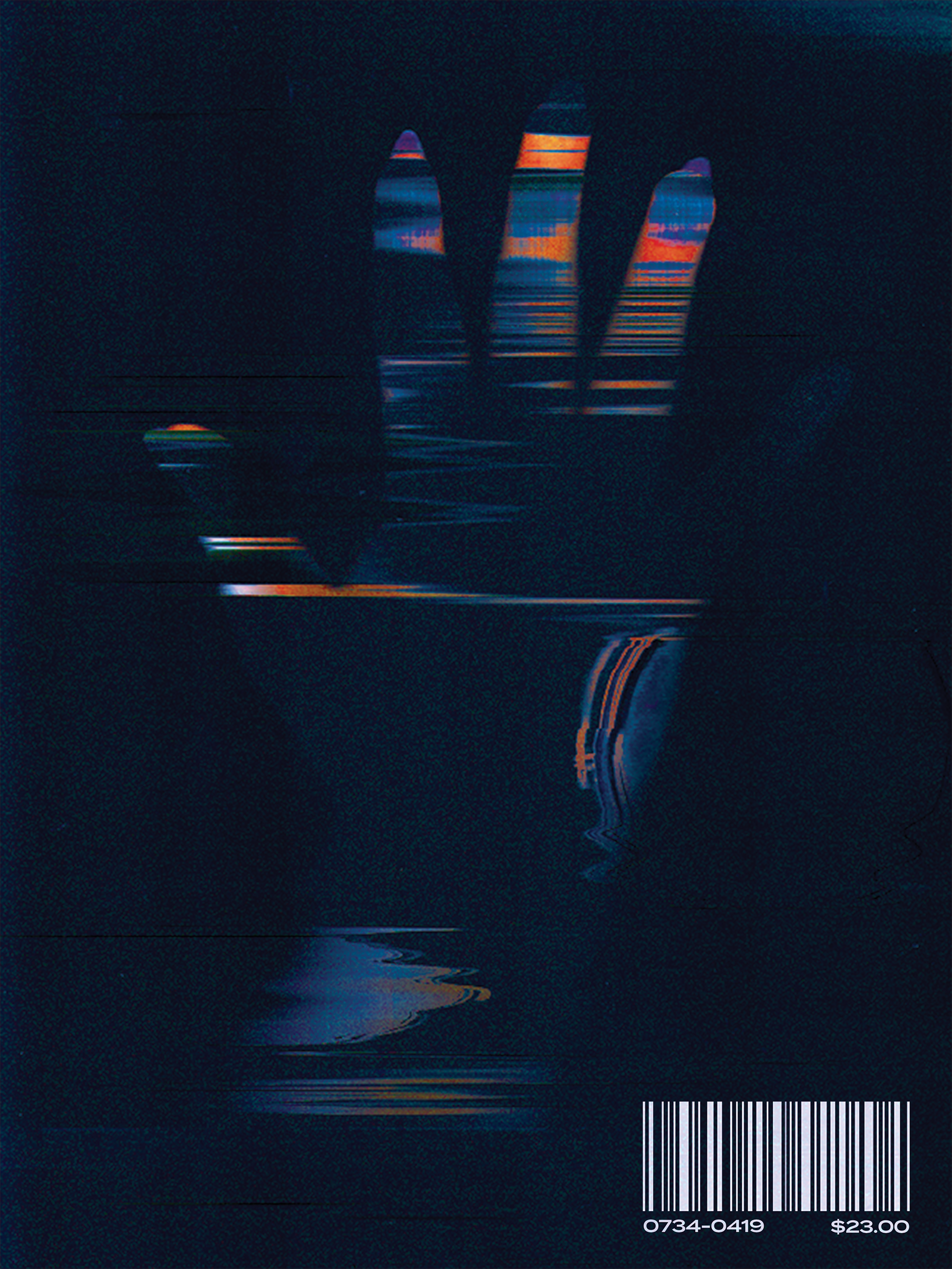
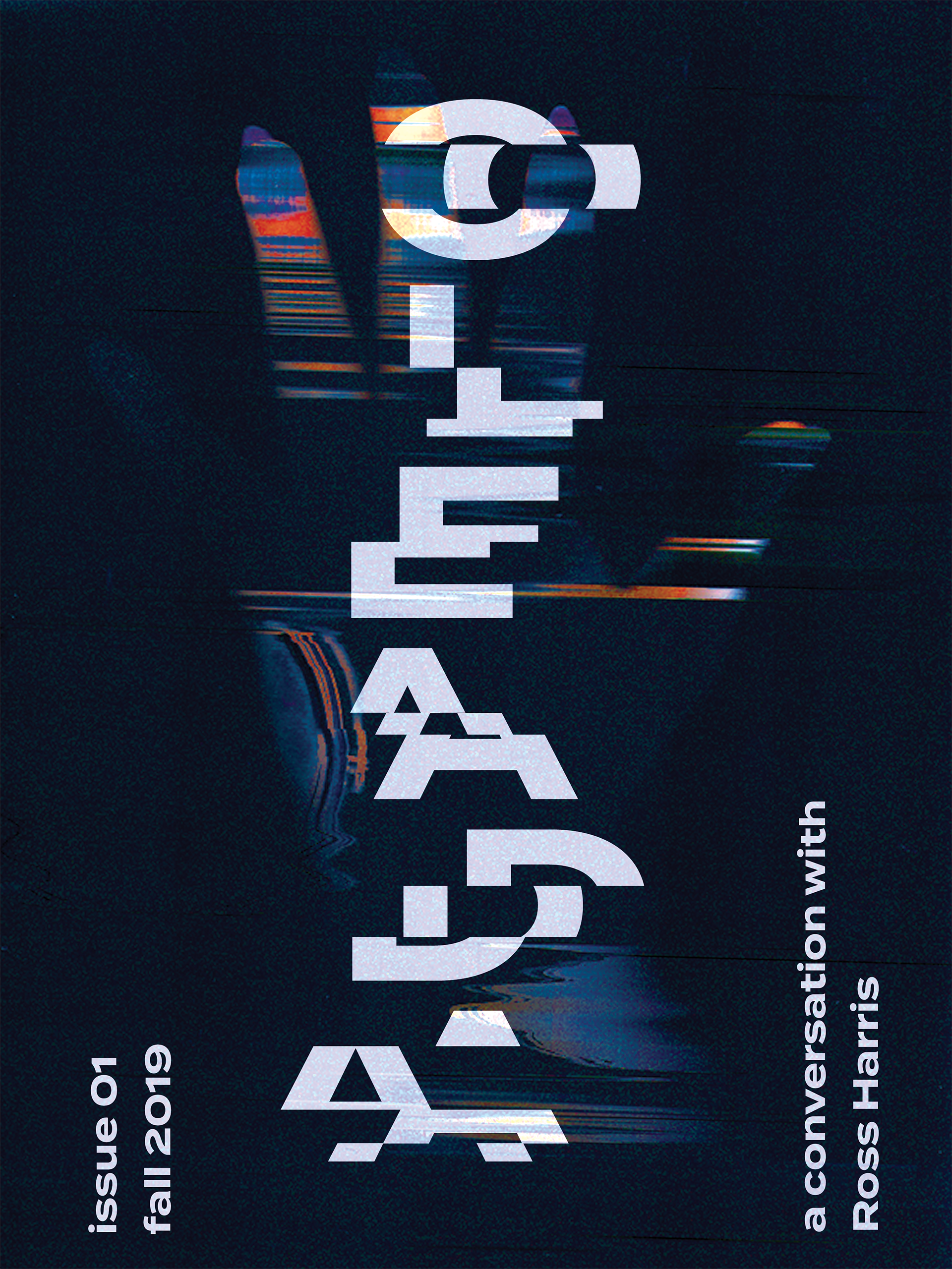


Cover Page Progress Work
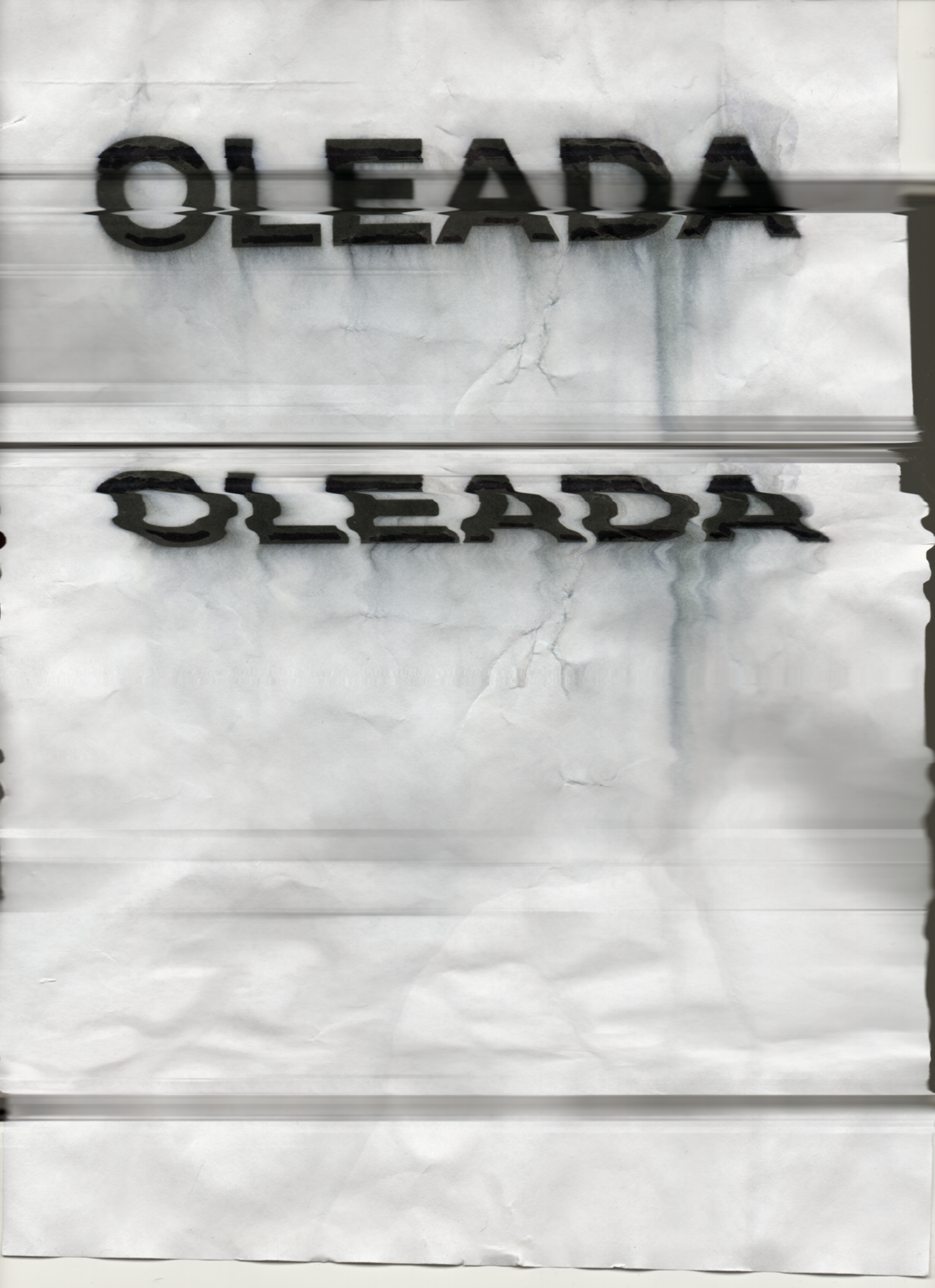
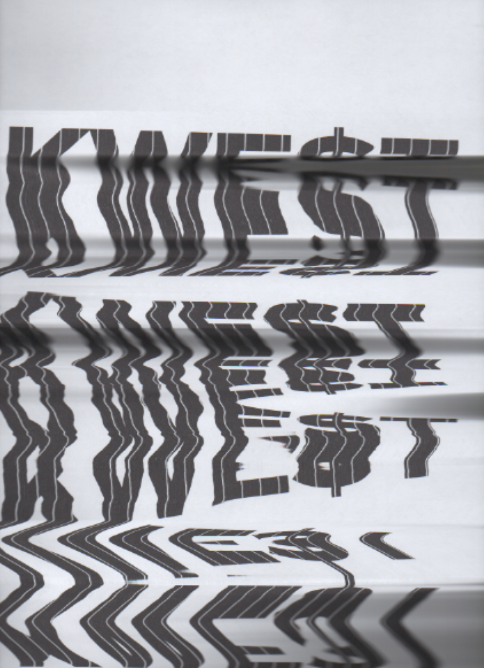
I would set up my type and images in photoshop, printed them out, and scanned different versions to try to get the reflective-water effect for my designs. After this, I used Photoshop to play with the texture of the paper and changed its hues to blue.

Final Cover Design

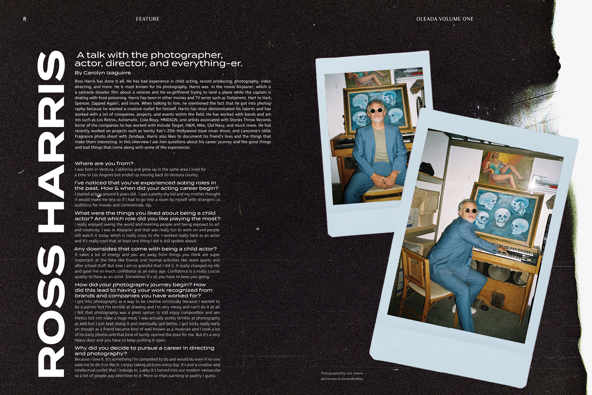
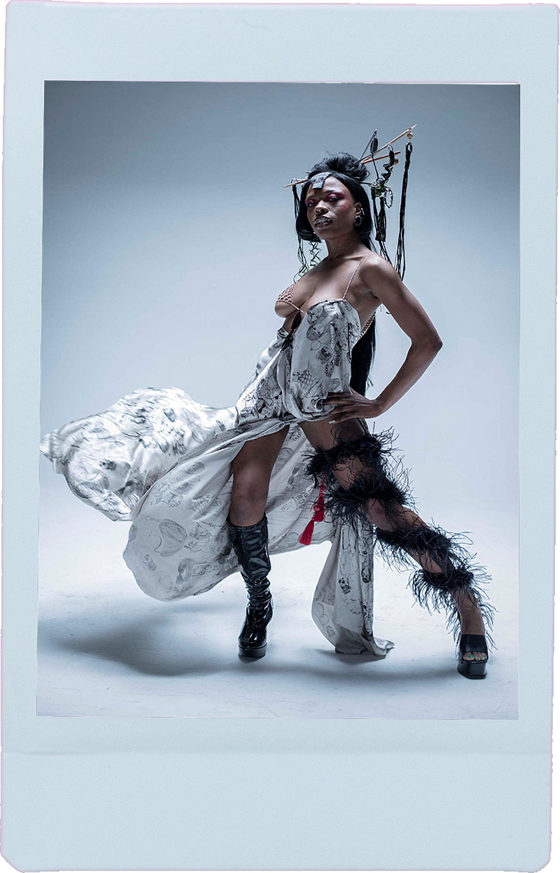
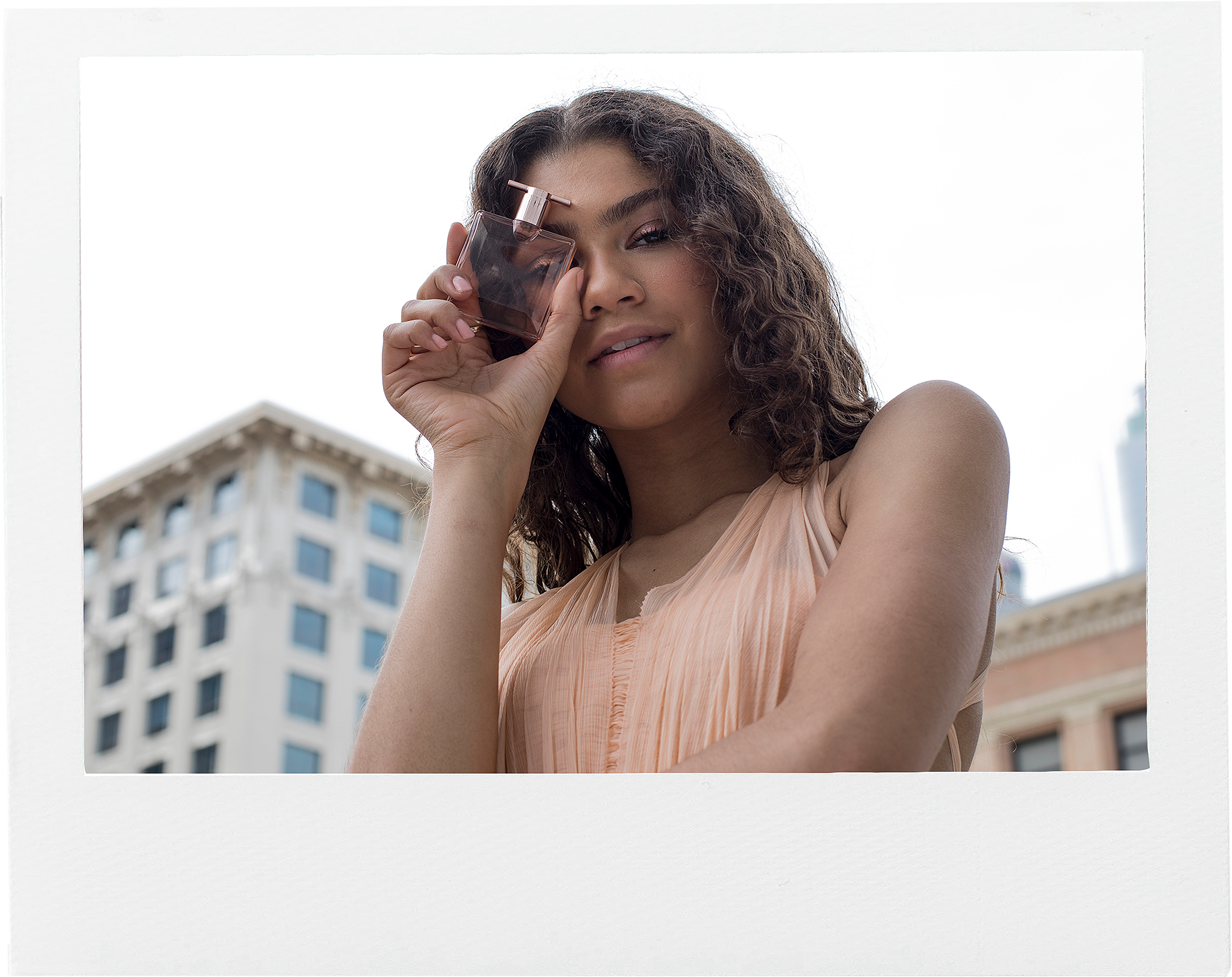
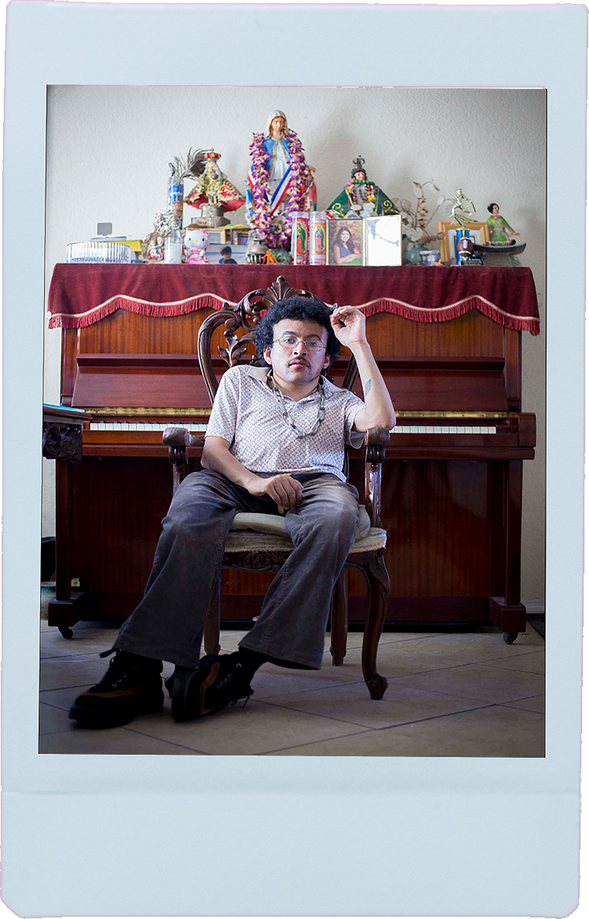
Ross Harris Feature
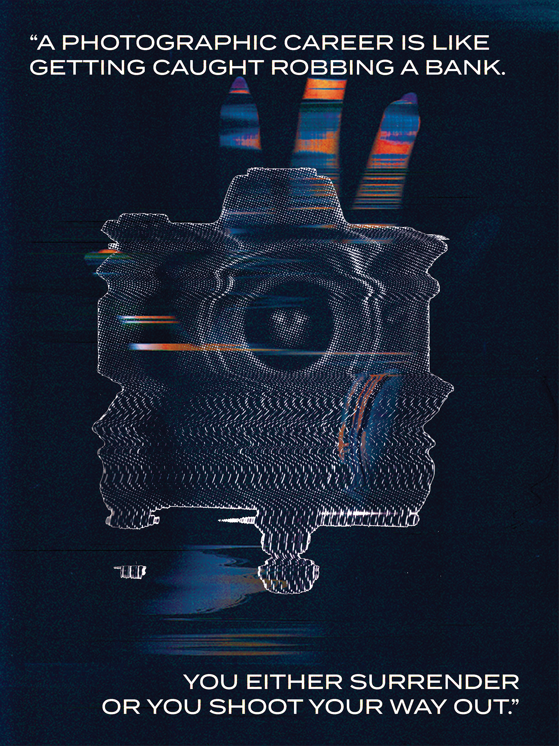
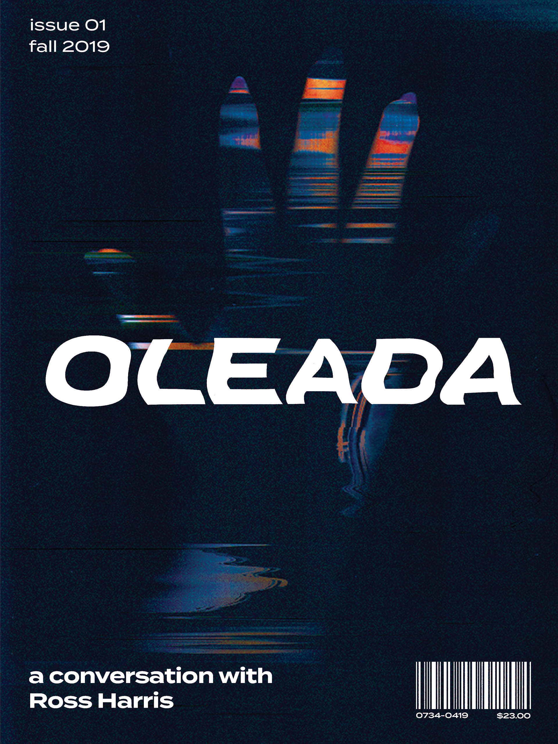
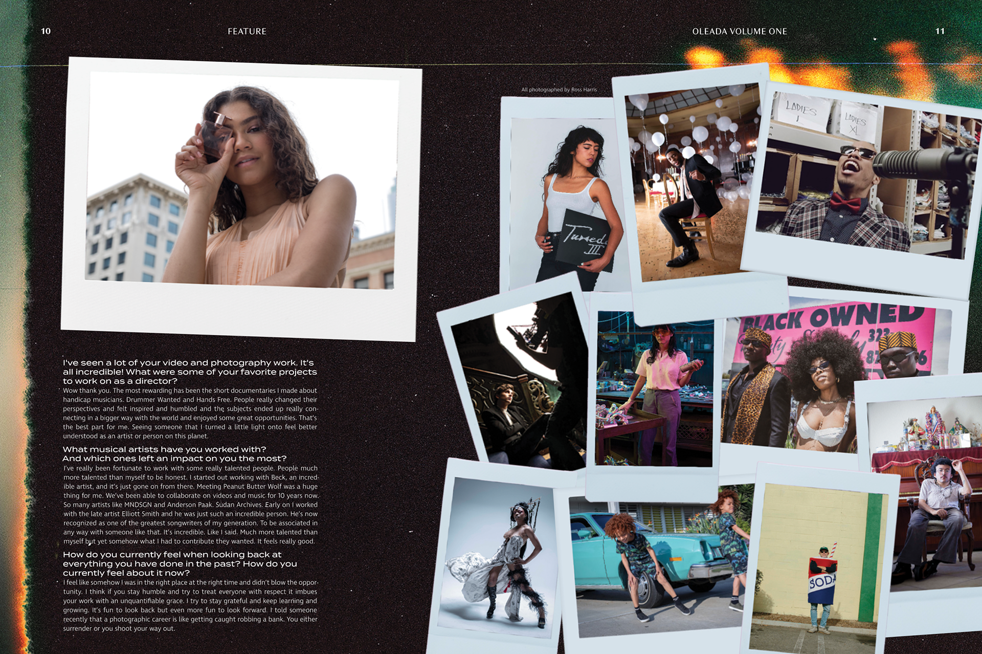
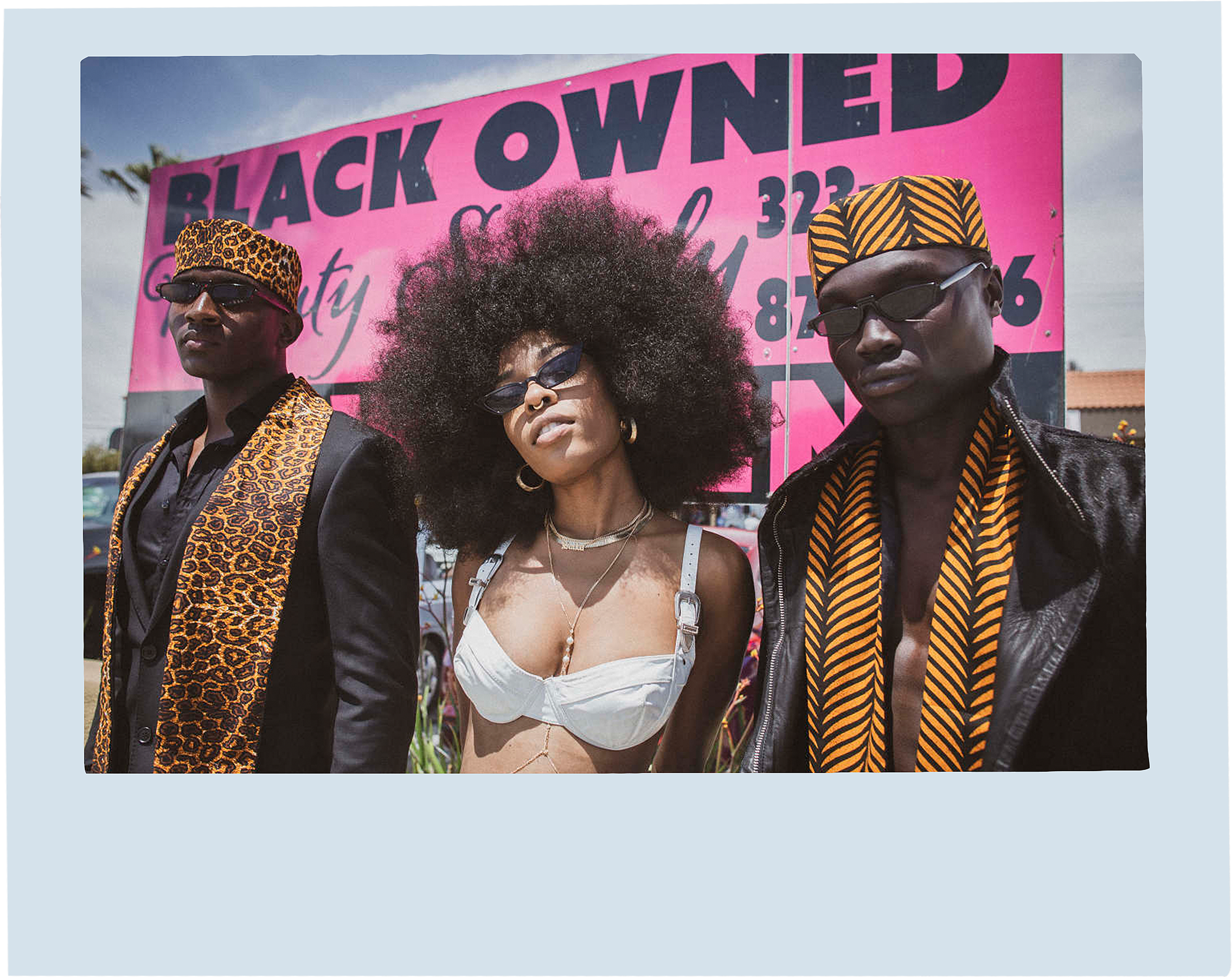
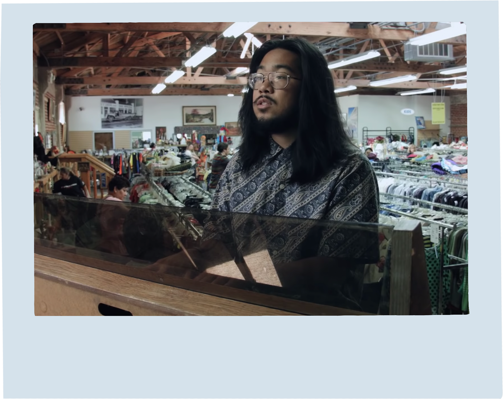
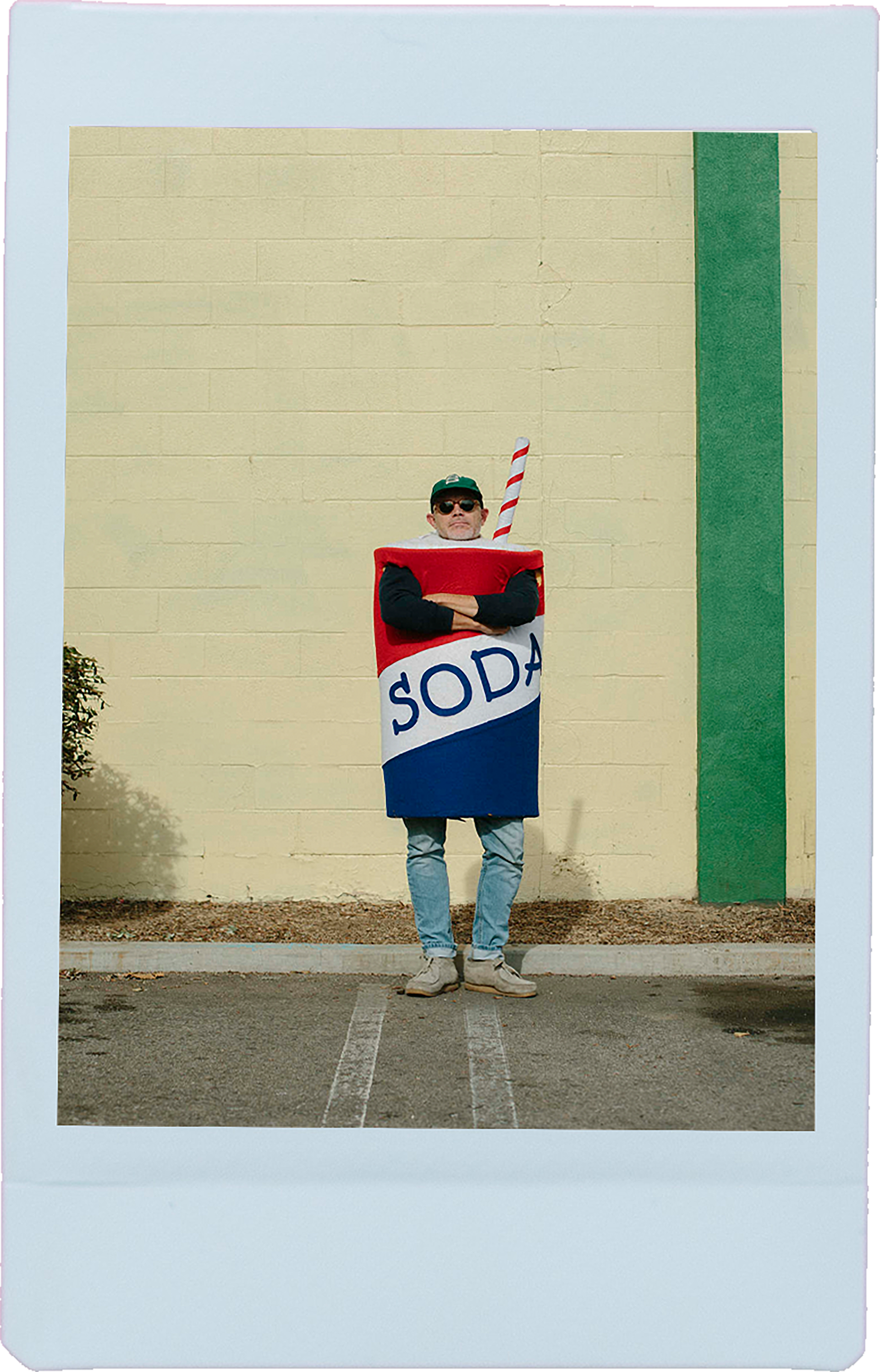
Although Harris has been many things, I really wanted to emphasize his photography career since it is what he is still currently doing today. I wanted to use polaroids that seemed to be thrown onto the page to emphasize the many different projects he has worked on.


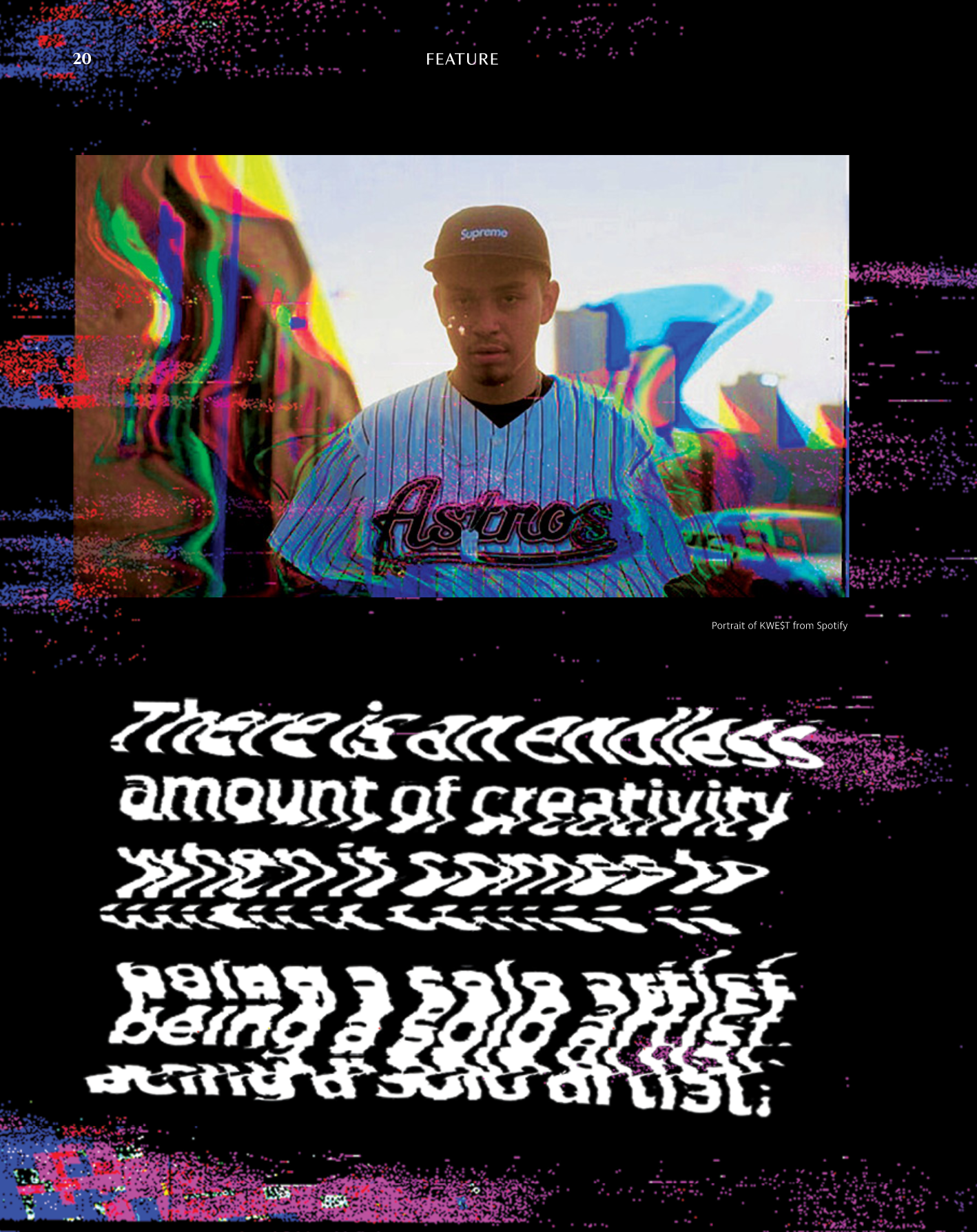
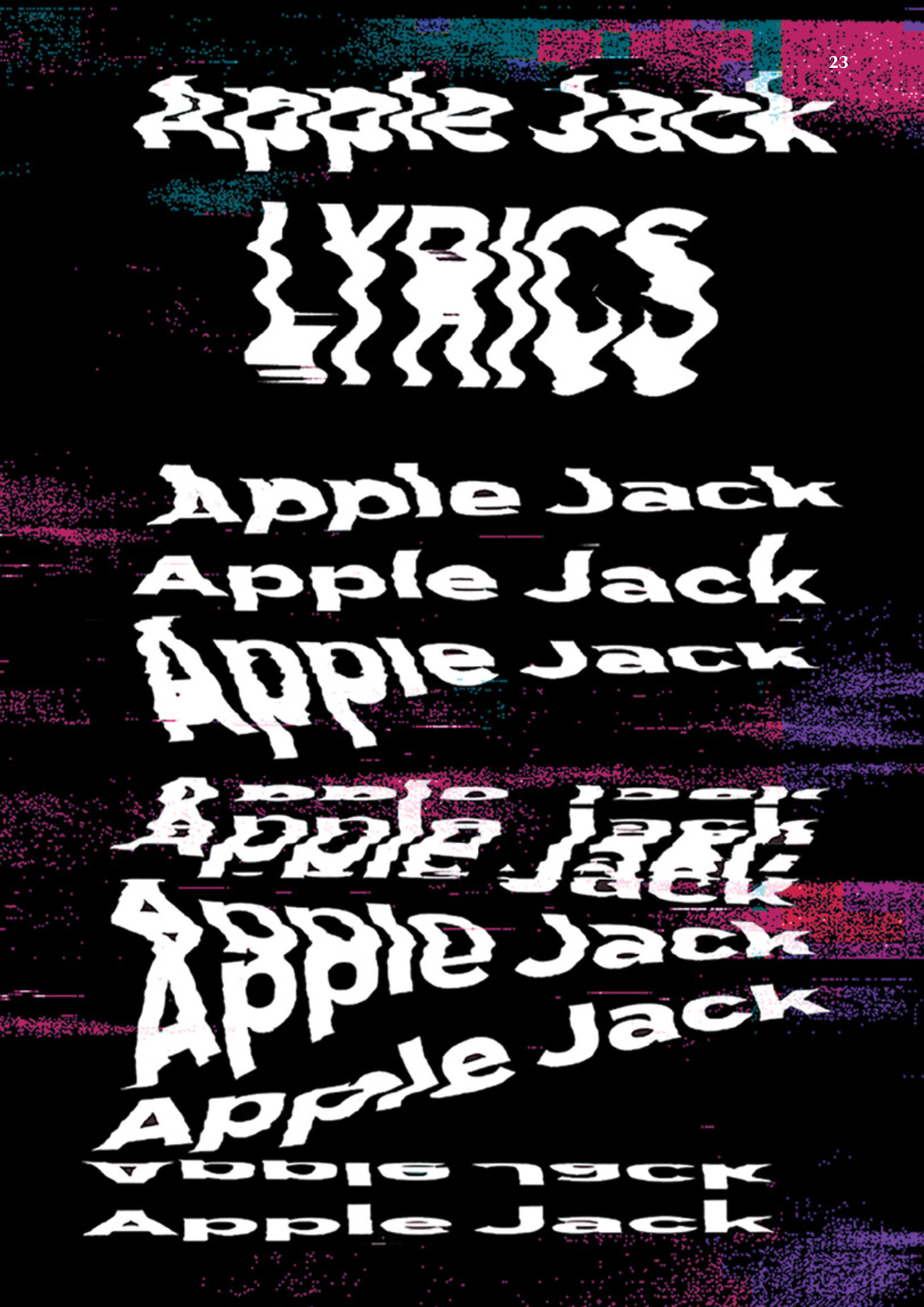
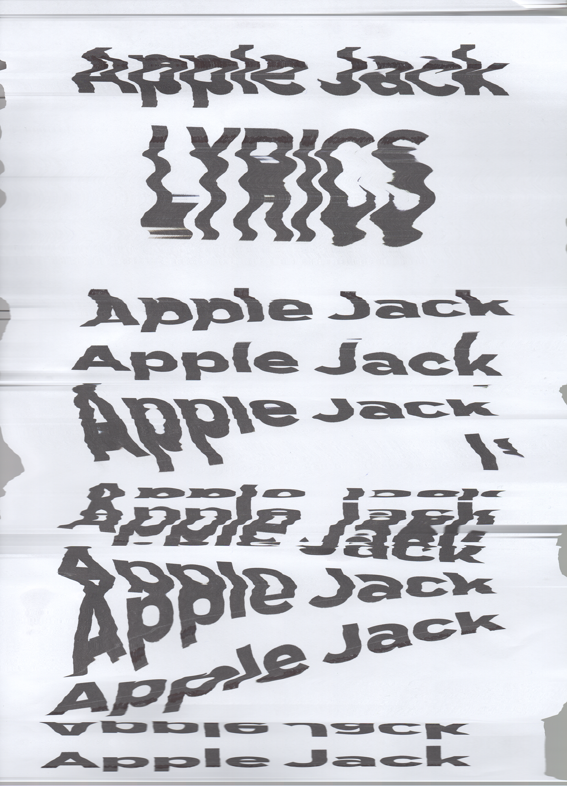
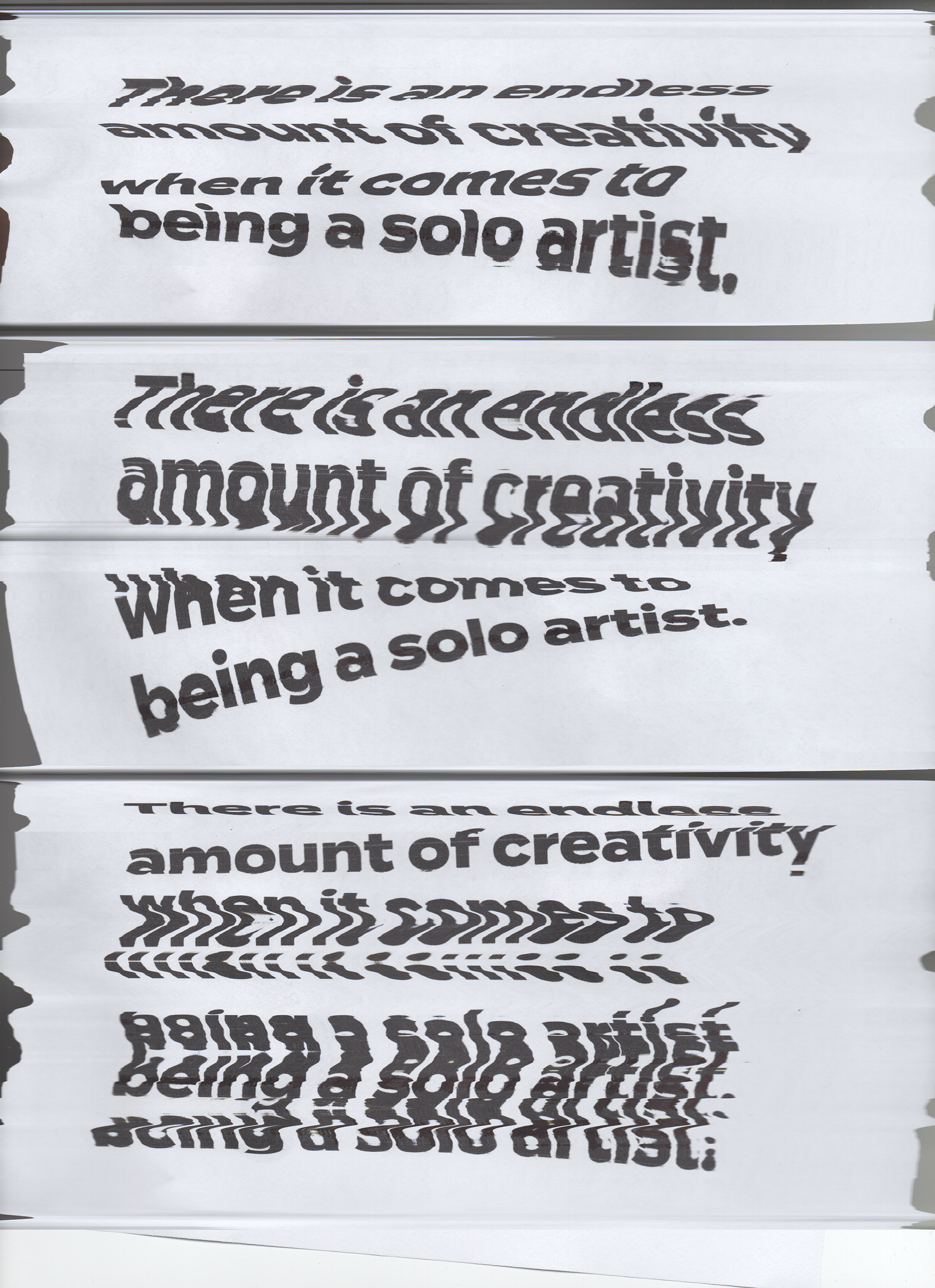
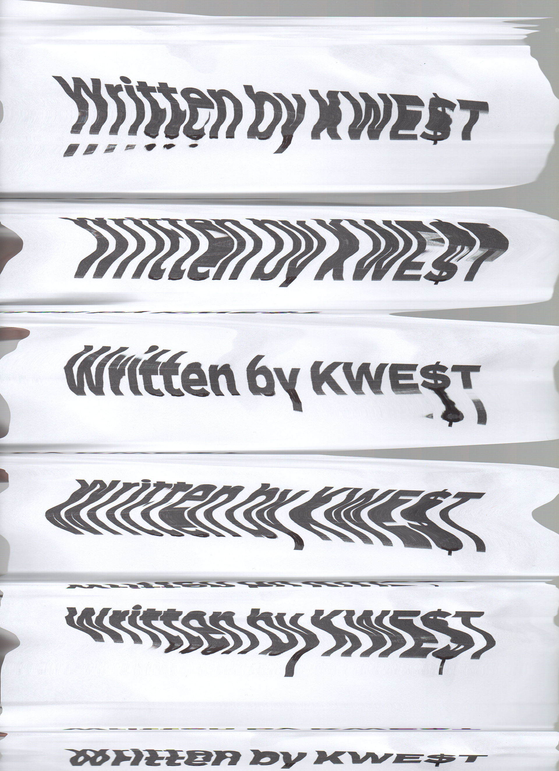
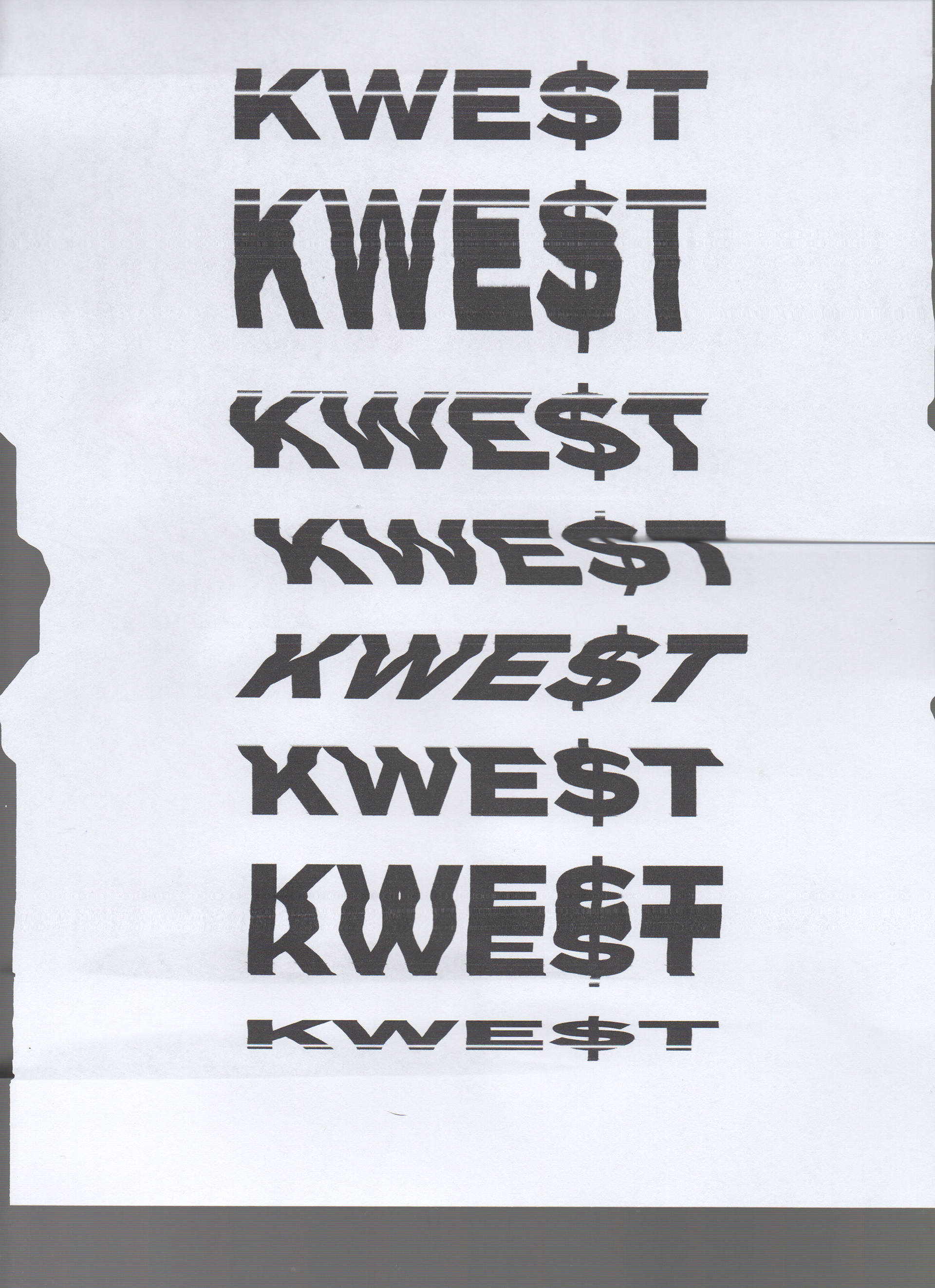
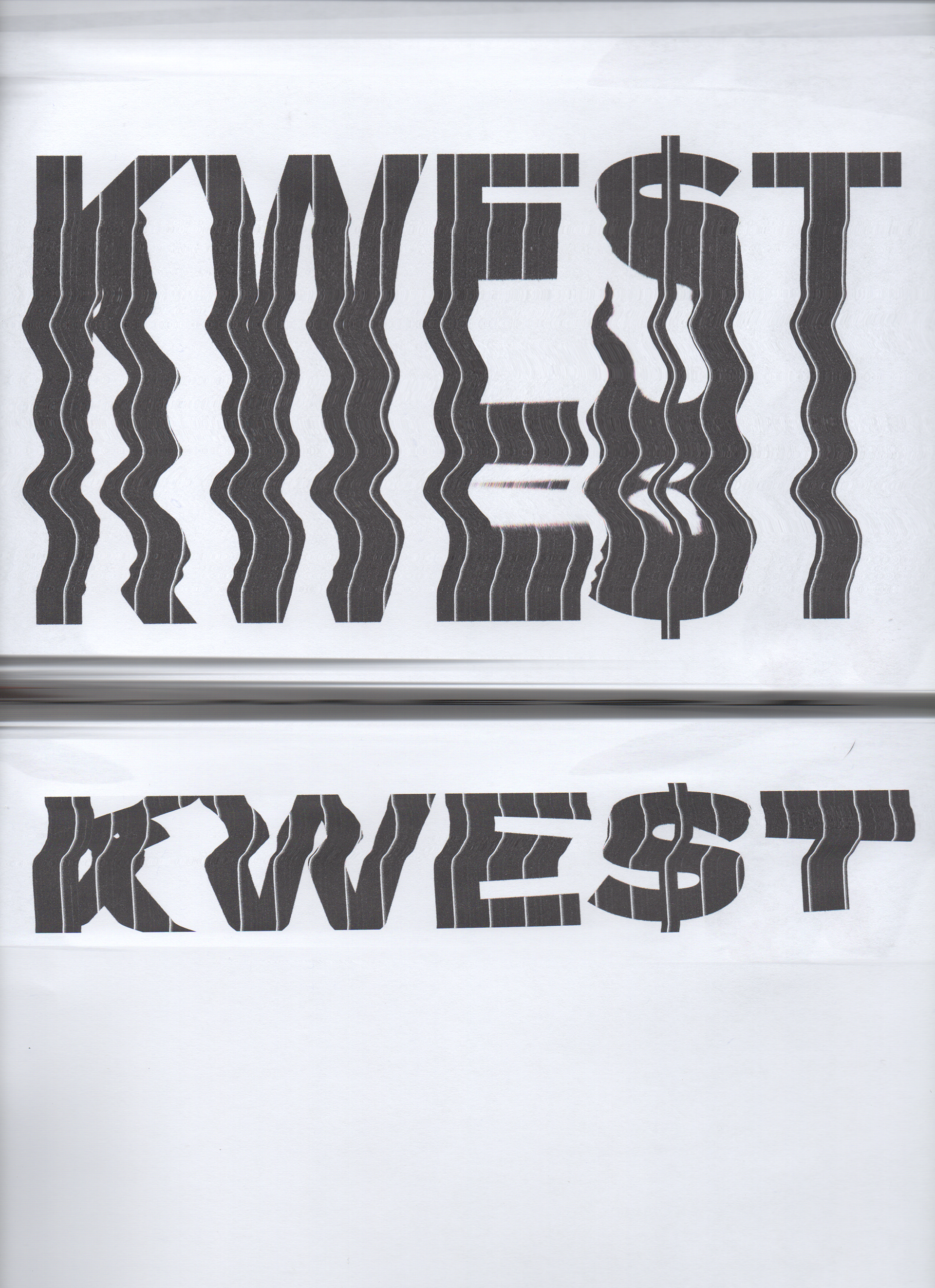
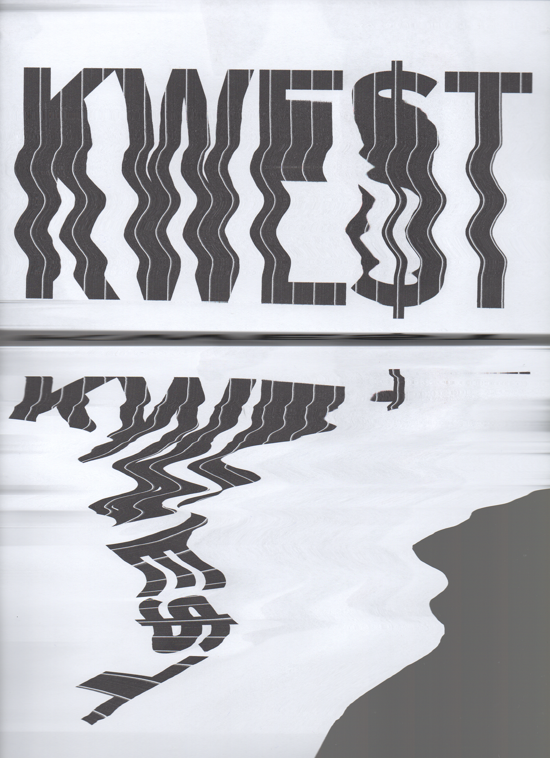
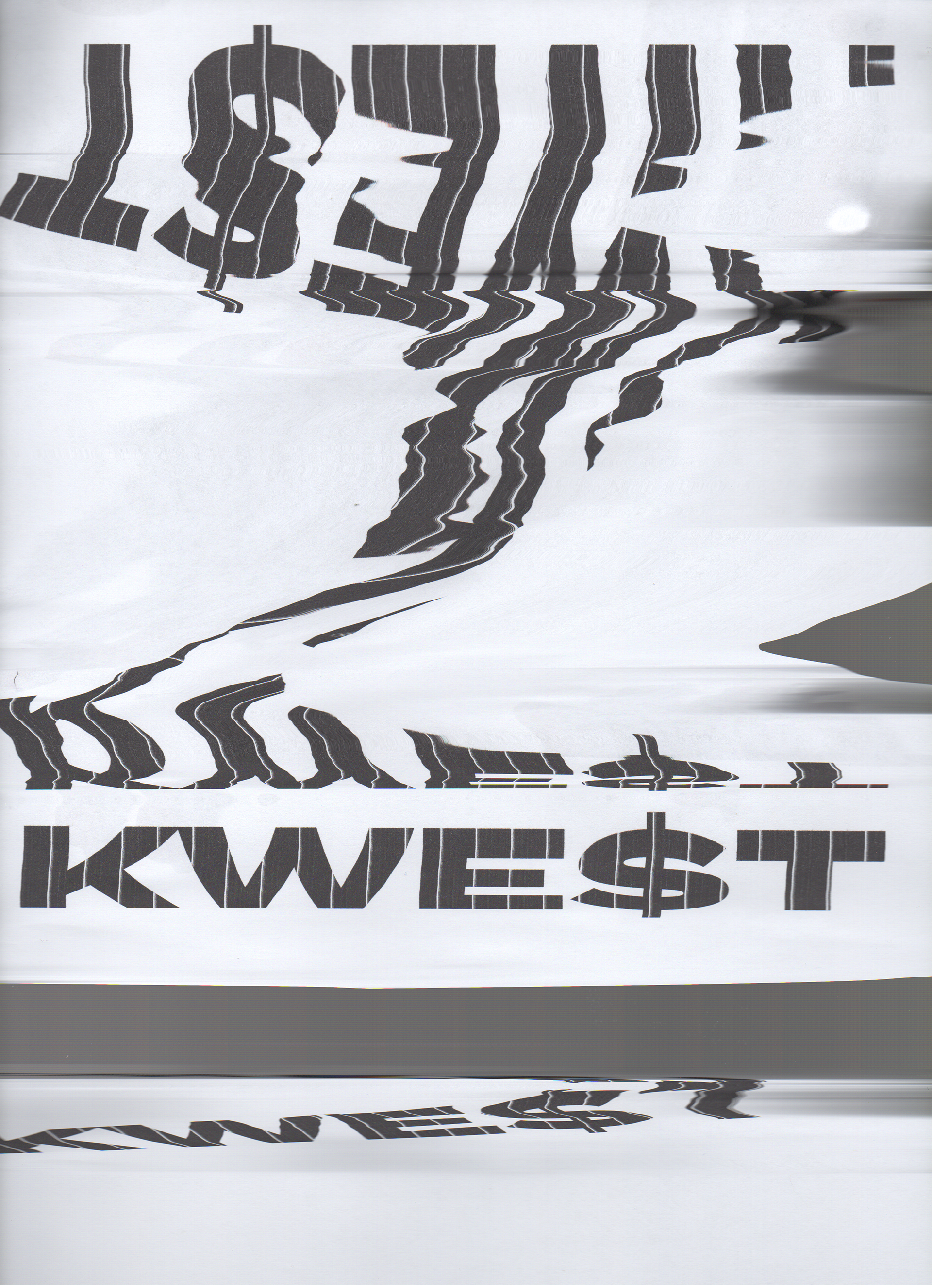
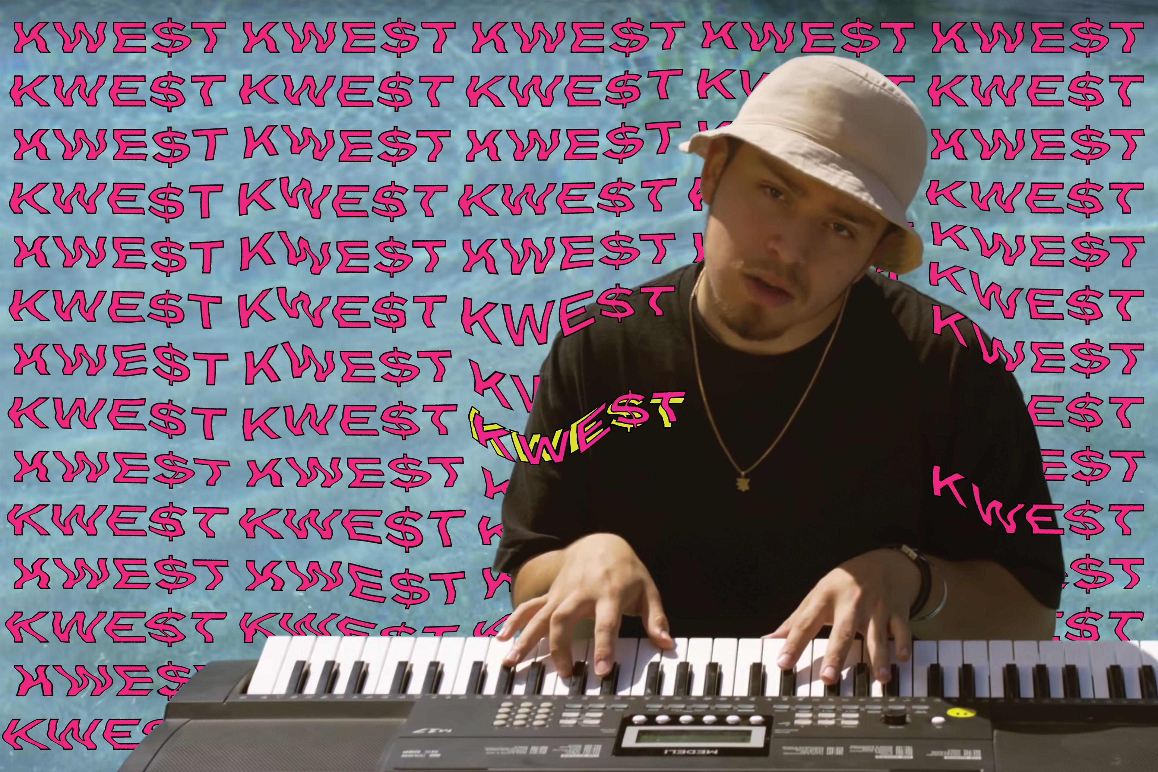
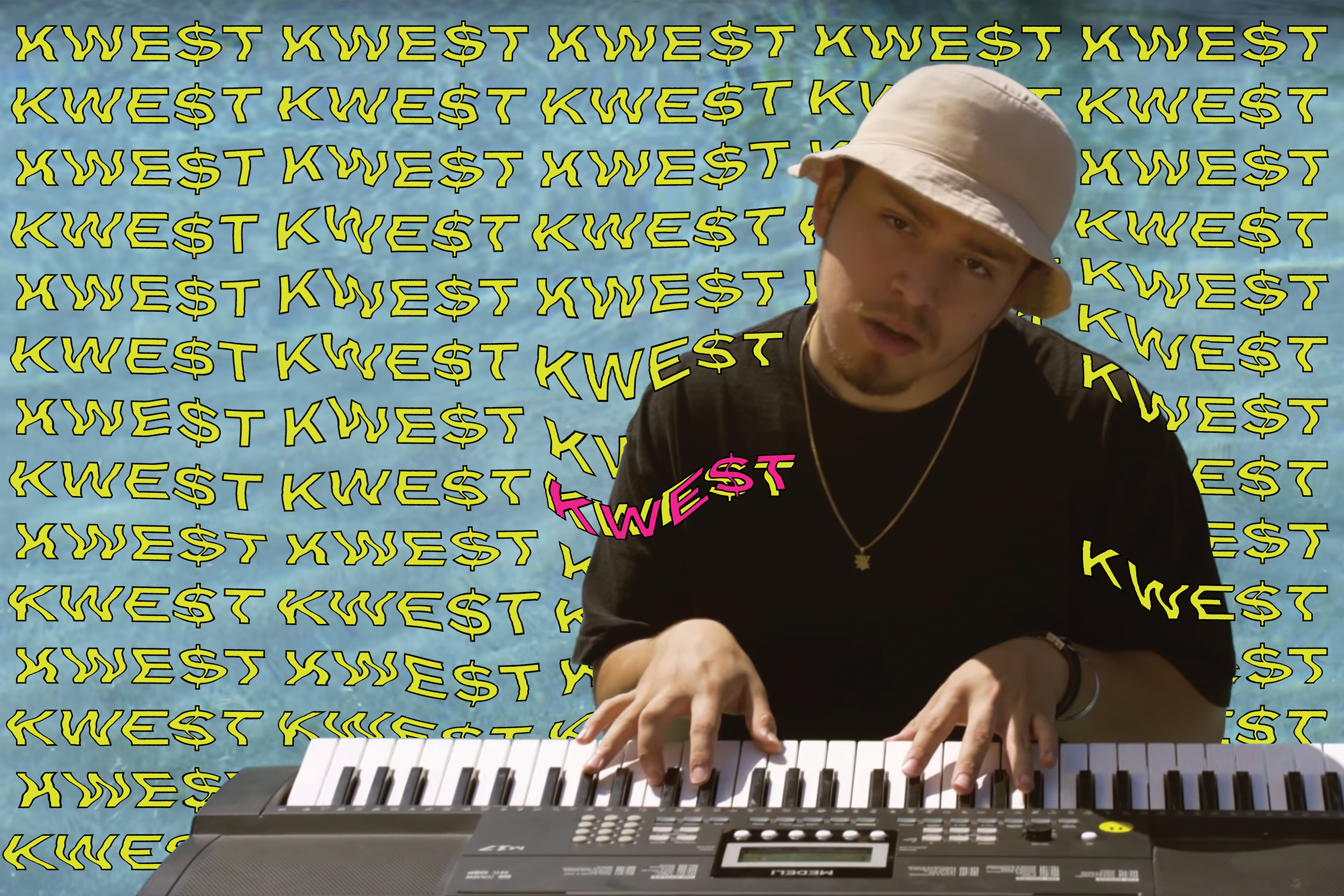
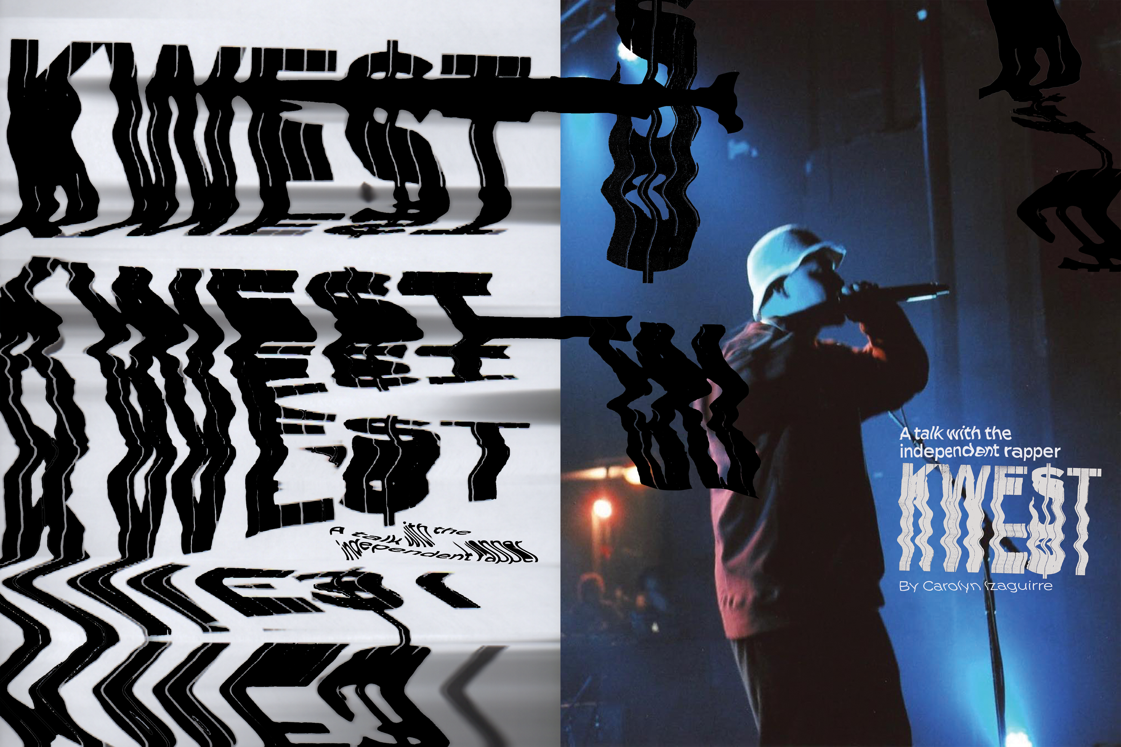
KWE$T Feature
KWE$T tends to be associated with a psychedelic-like visual, so I decided to really play with the drastic scans and glitched background. I wanted that to live on the page because it is also how I interpret his music.


Links to these artists instagram pages
Visual Artists:
Photographers:
Music Artists:
THANK YOU FOR YOUR TIME!